UI - ボタン
ElementとButtonコンポーネントを使用したシンプルなボタン。完全なシーンを参照してください。
アプリケーションのユーザーインターフェースを構築する場合、ほとんどの場合、ボタンを作成する必要があります。このチュートリアルでは、組み込みの要素を使用してそれを達成する方法を示します。
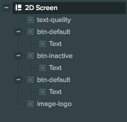
このシーンでは、次のように階層が設定された2D スクリーンを作成しました。
スクリーンの設定
私たちのスクリーンは次のように設定されています。
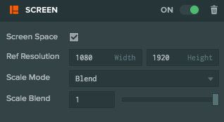
2Dスクリーンであるため、 Screen Space を選択しました。 Reference Resolution は、ターゲットとしている解像度です。この場合、1080 x 1920です。スケールモードとしてBlendを選択しているため、スクリーンは解像度の変更に適応します。また、スケールブレンドを1に設定しているため、スクリーンは高さの変更にのみ適応されます。
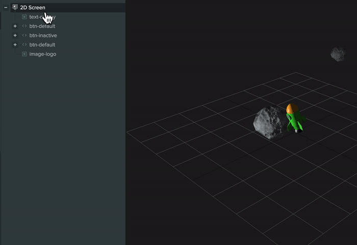
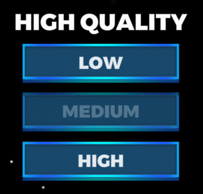
私たちのスクリーンには、最上部に表示されるロゴのためのImage Element、'SELECT QUALITY'を表示するText Element、3つのボタンなど、さまざまな子要素があります。
UIにボタンを追加する
ボタンをシーンに追加する方法は2つあります。
ヒエラルキーパネルを使用して
これは必要なエンティティ、コンポーネントを作成し、プロパティを事前設定するためにもっとも簡単な方法です。
既存の要素を使用して
ボタンに変えたい既存の要素がある場合は、インスペクターパネルでその要素にButtonコンポーネントを追加し、必要に応じて構成できます。
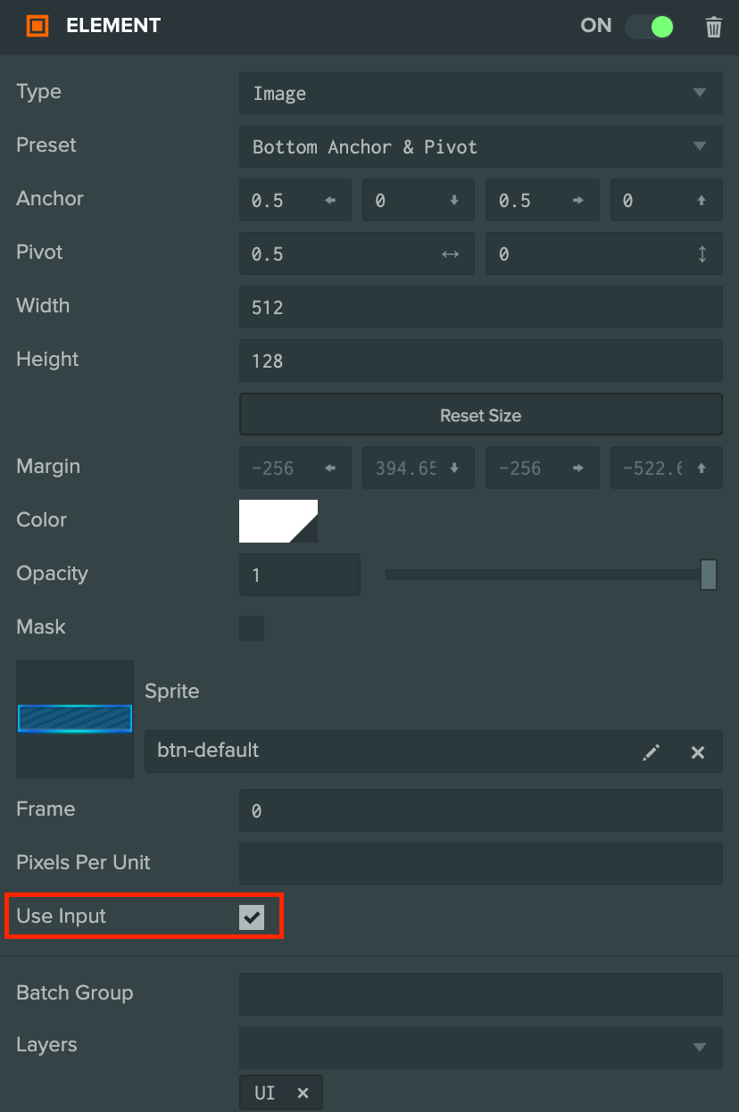
ユーザーがインタラクトできるように、ElementコンポーネントでUse Inputを有効にする必要があることを覚えてください。
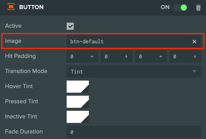
ButtonコンポーネントのImage Entityプロパティを、Elementコンポーネントがある同じエンティティに設定する必要があります。
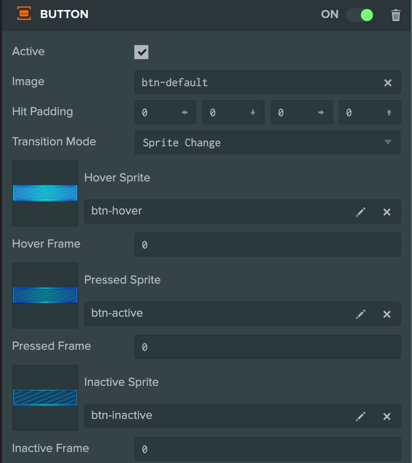
ボタン設定
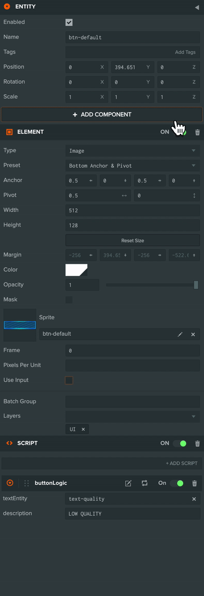
サンプルプロジェクトの最初のボタンをもう少し詳しく見てみましょう。
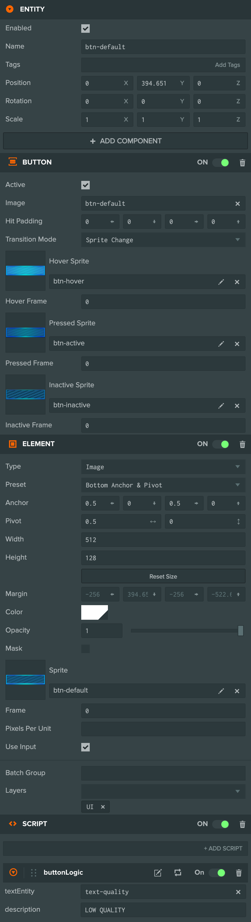
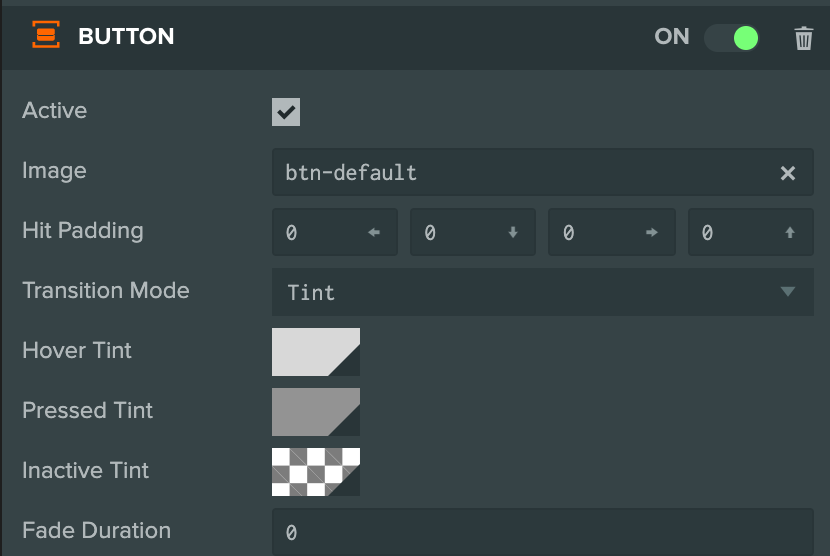
ボタンには3つのコンポーネントがあります。
- Elementコンポーネント - 親スクリーンに対してボタンUIを配置します。
- Buttonコンポーネント - ユーザーがインタラクトしたときにボタンがどのように見えるかを処理します。
- Scriptコンポーネント - Buttonコンポーネントのイベントをリッスンして、クリックされたときに何をするかを処理します。
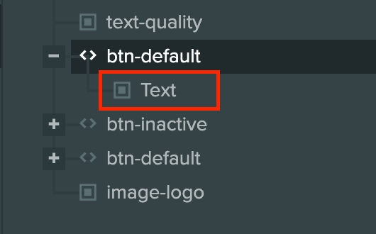
ボタンエンティティには、ボタンのスタイルによってオプションであるText Elementが子として含まれています。
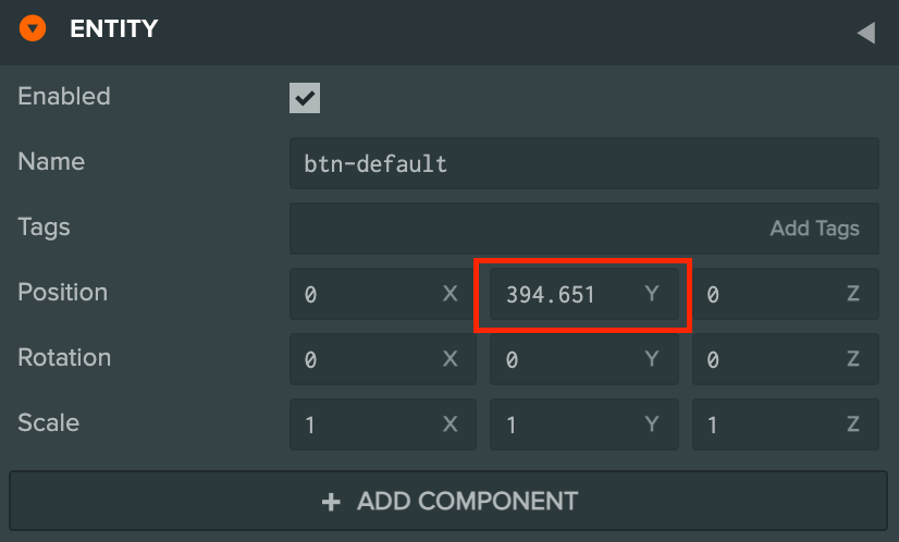
ElementのタイプはImageで、画面の下部にアンカーが設定されています。
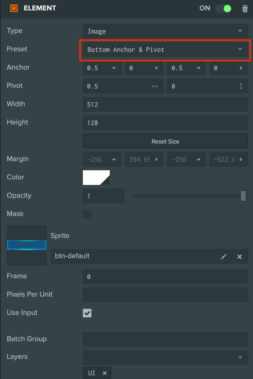
ボタンをアンカーし、それを下に移動するだけで、ボタンから下部までのオフセットを設定します。
ボタンをインタラクト可能にするには、Use Inputが有効になっている必要があります。
インタラクト時のボタンの見え方を変える
ユーザーがボタンをインタラクトしているときに、ボタンがどのように見えるかを以下の状態に応じて変更できます。
- Hover - マウスカーソルがボタン上にある場合
- Pressed - ユーザーがボタンを押した場合
- Inactive - ボタンが非アクティブな場合
これは2つのトランジションモードで行うことができます。
色を変更する
各状態でボタンの色を変更することは、ボタンとインタラクトしたときにユーザーフィードバックを追加する最も簡単な方法です。プロジェクトでは、High Qualityボタンに以下の設定があります。
次のエフェクトがあります。
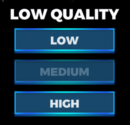
スプライトを変更する
ボタンの形状を変更したり、ボタンが画面に「押し込まれた」見え方をしたりしたい場合は、異なる状態でボタンのスプライト画像を変更することができます。Low Quality には以下の設定があります。
次のエフェクトがあります。
ボタンイベント
プロジェクトには、ボタンをクリックしたときにテキストを更新するスクリプトがあります。
var ButtonLogic = pc.createScript('buttonLogic');
ButtonLogic.attributes.add('textEntity', {
    type: 'entity',
    description: 'The entity that we want to update when the button is clicked'
});
ButtonLogic.attributes.add('description', {type: 'string'});

// initialize code called once per entity
ButtonLogic.prototype.initialize = function() {
    this.entity.button.on('click', function(event) {
        this.textEntity.element.text = this.description;
    }, this);
};
このスクリプトは、シーン内のボタンエンティティにアタッチされています。
ボタンコンポーネントには、マウスとタッチ入力の両方に対して機能するコールバック関数を登録できるクリックイベント があります。
this.entity.button.on('click', function(event) {
    this.textEntity.element.text = this.description;
}, this);
mouseenter と mouseleave など、他のリッスンできるイベントもあります。完全なリストはAPIドキュメントにあります。
これらのイベントは、ElementコンポーネントでUse Inputが有効になっている場合にのみ発生するため、インスペクタでそれがチェックされていることを確認してください。