User Interface - Stats Counter
How to use buttons, progress bars and interact with elements. See the full scene.
In this tutorial we are going to use the built-in Elements to create a few simple widgets that allow you to increase a stat by clicking on plus / minus buttons.
For each stat we need a minus button, a plus button, a progress bar and some text to show the current stat value.
Hierarchy
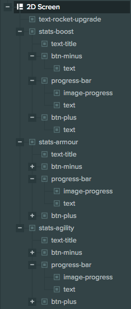
This is what our UI looks like in the Hierarchy:

Screen setup
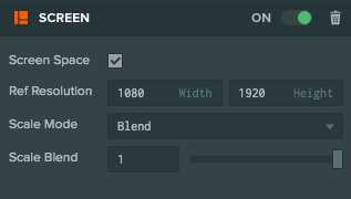
First we start by adding a new 2D Screen. This is what our Screen looks like:

Since it's a 2D screen we have ticked Screen Space. Our Reference Resolution is the resolution that we are targeting - in this case it's 1080 x 1920. We choose Blend for Scale Mode so that our Screen adapts to resolution changes and we set Scale Blend to 1 so that the Screen will adapt only to height changes.
Stats setup
For each stat we will create a different Group Element. This allows us to treat sub-elements of the Group to be anchored to the Group edges and allows us to treat each stat as a separate widget.
We will only examine the Boost stat - the others are exactly the same. This is what the stats-boost Entity looks like in the viewport:

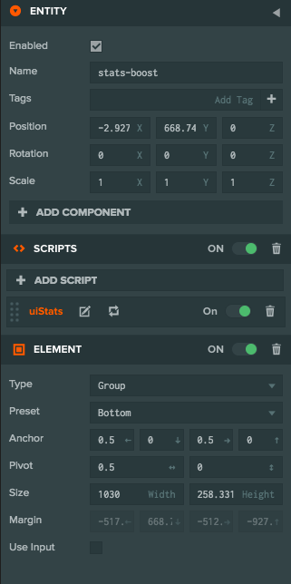
And these are its attributes:

As you can see it has a Group Element component with the appropriate size to contain all our elements and it's anchored to the bottom of the screen. It also has a Script Component with the script uiStats assigned to it. This script will allow us to handle interactions with the Elements of the group.
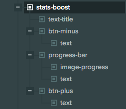
This is what our group looks like in the Hierarchy:

Our group has the following child Elements:
text-title: A Text Element for the title of the group - anchored to the top of the group.btn-minus: An Image Element that has a child Text Element. This is our minus button and it's anchored to the bottom left of the group.btn-plus: An Image Element that has a child Text Element. This is our plus button and it's anchored to the bottom right of the group.progress-bar: Our progress bar anchored to the bottom of the Group. This is an Image Element for the background of the progress bar and it has 2 child Elements:image-progress: The resizable Image Element that actually displays progress. Anchored to the left of theprogress-barElement.text: The Text Element that displays our stats. Anchored to the center of theprogress-barElement.
Scripts
We have a script on each button to allow us to change their texture based on hover states. This is similar to the script found in this tutorial. We also have a script to handle our progress bar. There is more info on progress bars in this tutorial.
The main script that handles the interactions for each stat is uiStats:
- ESM
- Classic
import { Script, math } from 'playcanvas';

export class UiStats extends Script {
    static scriptName = "uiStats";

    initialize() {
        // find our widgets
        this.btnPlus = this.entity.findByName('btn-plus');
        this.btnMinus = this.entity.findByName('btn-minus');
        this.progressBar = this.entity.findByName('progress-bar');
        this.progressText = this.progressBar.findByName('text');

        // initialize value to 0
        this.setValue(0);

        // increase value with plus button
        this.btnPlus.element.on('click', (evt) => {
            this.setValue(this.value + 1);
        });

        // decrease value with minus button
        this.btnMinus.element.on('click', (evt) => {
            this.setValue(this.value - 1);
        });
    }

    // Sets the stat value
    setValue(value) {
        // clamp between min and max
        this.value = math.clamp(value, 0, 10);
        // set progress
        this.progressBar.script.progressBar.setProgress(this.value / 10);
        // update progress text
        this.progressText.element.text = this.value + ' / ' + 10;
    }
}
var UiStats = pc.createScript('uiStats');

UiStats.prototype.initialize = function() {
    // find our widgets
    this.btnPlus = this.entity.findByName('btn-plus');
    this.btnMinus = this.entity.findByName('btn-minus');
    this.progressBar = this.entity.findByName('progress-bar');
    this.progressText = this.progressBar.findByName('text');

    // initialize value to 0
    this.setValue(0);

    // increase value with plus button
    this.btnPlus.element.on('click', function (evt) {
        this.setValue(this.value + 1);
    }, this);

    // decrease value with minus button
    this.btnMinus.element.on('click', function (evt) {
        this.setValue(this.value - 1);
    }, this);
};

// Sets the stat value
UiStats.prototype.setValue = function (value) {
    // clamp between min and max
    this.value = pc.math.clamp(value, 0, 10);
    // set progress
    this.progressBar.script.progressBar.setProgress(this.value / 10);
    // update progress text
    this.progressText.element.text = this.value + ' / ' + 10;
};
In this script we find our child elements and when the plus or minus buttons are clicked we increase / decrease the stat and update the progress bar and its text.