Screens
A screen is the root of an interface. It is an entity with a screen component, and the elements below it are laid out in its space. The screen decides whether the interface is drawn over the camera's view or placed in the scene, what its units measure, and how it grows and shrinks with the canvas.
Screen Space and World Space
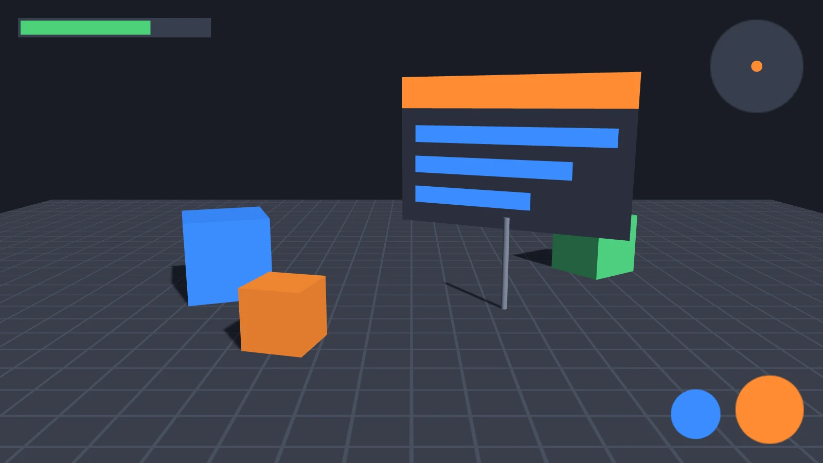
A screen-space screen is drawn over the camera's view, wherever the camera is, and is always the size of the canvas. Use it for HUDs, menus and any other interface that belongs to the screen rather than the world.
A world-space screen is placed in the scene by its entity's transform and drawn with the rest of the scene: a sign on a wall, a panel above a machine or a menu in XR. Its size is its resolution, in the entity's local units, centered on the entity. See World-Space UI.
- Engine
- Editor
- React
- Web Components
// Drawn over the camera's view, the size of the canvas
const hud = new pc.Entity('hud');
hud.addComponent('screen', {
    screenSpace: true,
    scaleMode: pc.SCALEMODE_BLEND,
    referenceResolution: [1280, 720]
});
app.root.addChild(hud);

// Placed in the scene: 640 × 320 units, scaled to 6.4 × 3.2 meters
const sign = new pc.Entity('sign');
sign.addComponent('screen', {
    screenSpace: false,
    resolution: [640, 320]
});
sign.setLocalScale(0.01, 0.01, 0.01);
sign.setPosition(0, 2, -5);
app.root.addChild(sign);
In the Hierarchy, click + and choose User Interface › 2D Screen for a screen-space screen, or User Interface › 3D Screen for a world-space one. The entity of a 3D Screen is created with a scale of 0.01.
To switch an existing screen between the two, toggle Screen Space on its Screen component. The inspector shows Resolution only for world-space screens, and Scale Mode only for screen-space ones.
<Entity name="hud">
  <Screen referenceResolution={[1280, 720]} />
</Entity>
<Entity name="sign" position={[0, 2, -5]} scale={[0.01, 0.01, 0.01]}>
  <Screen screenSpace={false} resolution={[640, 320]} />
</Entity>
<Screen> is a screen-space screen unless you set screenSpace={false}.
<pc-entity name="hud">
    <pc-screen screen-space scale-mode="blend" reference-resolution="1280 720"></pc-screen>
</pc-entity>
<pc-entity name="sign" position="0 2 -5" scale="0.01 0.01 0.01">
    <pc-screen resolution="640 320"></pc-screen>
</pc-entity>
<pc-screen> is a world-space screen unless it has the screen-space attribute.
Both kinds hold the same elements, laid out in the same way.
Units and Resolution
Elements are positioned and sized in screen units, with the y axis pointing up. What a unit measures depends on the screen:
| Screen | Resolution | One unit is |
|---|---|---|
| Screen space, Scale Mode None | The size of the canvas's drawing buffer, updated whenever the canvas is resized | One pixel of the drawing buffer |
| Screen space, Scale Mode Blend | The same | scale pixels of the drawing buffer. See Scaling with Blend |
| World space | The resolution you set, 640 × 320 by default | One unit of the entity's local space |
A screen-space screen sets its own resolution, so writing to resolution has no effect on it. When the canvas changes size, elements anchored to the screen's edges and corners move with them.
Scaling with Blend
With Scale Mode set to None, an interface is built in pixels and keeps its size in pixels. An interface that fits the canvas it was designed for looks small on a larger canvas, and runs off the edges of a smaller one. With Blend, you design the interface at a reference resolution, and the screen scales it to the canvas it is shown on, so it keeps its proportions everywhere:

- Engine
- Editor
- React
- Web Components
const screen = new pc.Entity('screen');
screen.addComponent('screen', {
    screenSpace: true,
    scaleMode: pc.SCALEMODE_BLEND,
    referenceResolution: [1280, 720],
    scaleBlend: 0.5
});
app.root.addChild(screen);
To change the reference resolution later, assign a new pc.Vec2 to referenceResolution.
Set Scale Mode to Blend, then set Ref Resolution and Scale Blend. The inspector shows these two fields only in Blend mode.
<Entity name="screen">
  <Screen referenceResolution={[1280, 720]} scaleBlend={0.5} />
</Entity>
<Screen> scales with Blend unless you set scaleMode="none".
<pc-entity name="screen">
    <pc-screen screen-space scale-mode="blend" reference-resolution="1280 720" scale-blend="0.5"></pc-screen>
</pc-entity>
The screen compares the canvas with the reference resolution one axis at a time, and Scale Blend weights the two axes:
scale = (width / reference width) ^ (1 - Scale Blend) × (height / reference height) ^ Scale Blend
With a reference resolution of 1280 × 720, a 1920 × 1080 canvas scales the interface by 1.5 and a 640 × 360 canvas by 0.5, whatever the Scale Blend, because both canvases have the same shape as the reference. Scale Blend only matters when the canvas has a different shape. The screen's scale property holds the current factor.
Scale Mode applies only to screen-space screens. A world-space screen is always unscaled, so size it with its entity's scale instead.
Choosing the Scale Blend
Scale Blend decides which dimension of the canvas the interface follows:
| Scale Blend | The interface scales with | Suits |
|---|---|---|
| 0 | The width of the canvas | Portrait layouts, and interfaces that must always fit across the canvas |
| 0.5 | The width and the height equally | Interfaces shown in both orientations. Turning a phone on its side does not change the scale |
| 1 | The height of the canvas | Landscape games, whose HUD must fit from top to bottom |
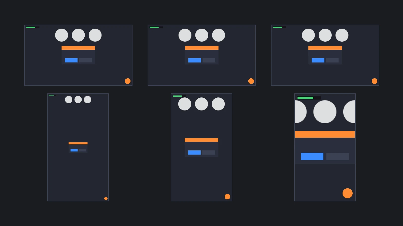
At 0.5, the scale depends only on the area of the canvas, so turning a phone on its side keeps the interface the same size, but a layout designed for a landscape reference resolution can be too wide for a portrait canvas. To keep the whole reference area on screen, whatever the shape of the canvas, follow whichever axis has less room and check again whenever the canvas changes size:
// Follow whichever axis has less room, so the whole reference area stays on screen
const fitReference = () => {
    const { resolution, referenceResolution } = screen.screen;
    const wider = resolution.x / referenceResolution.x > resolution.y / referenceResolution.y;
    screen.screen.scaleBlend = wider ? 1 : 0;
};
fitReference();
app.graphicsDevice.on('resizecanvas', fitReference);
Pixel Ratio
On a high-density display, the canvas's drawing buffer can have more pixels than the canvas has CSS pixels on the page. That makes rendering sharper, and costs more to draw. The graphics device's maxPixelRatio caps the ratio between the two, and each surface sets it differently:
| Surface | Drawing buffer, by default |
|---|---|
| Engine | The canvas's CSS size, as maxPixelRatio is 1. Set app.graphicsDevice.maxPixelRatio to window.devicePixelRatio for full resolution |
| Editor | The CSS size, or the display's full pixel ratio when Device Pixel Ratio is enabled in the Rendering settings |
| React | The CSS size. Set maxPixelRatio on the graphics device of the application that useApp() returns |
| Web Components | The display's full pixel ratio. Cap it with the max-pixel-ratio attribute of <pc-app> |
The pixel ratio affects the two scale modes differently:
- Blend: the screen's resolution and its scale grow together, so a higher pixel ratio leaves the interface the same size on the page and only makes it sharper.
- None: one unit is one pixel of the drawing buffer, so a higher pixel ratio makes the interface smaller. At a pixel ratio of 2, a 100 unit button is 50 CSS pixels wide.
Pixel-Perfect Images
With Scale Mode None, an image element the size of its texture draws each texel as one pixel of the drawing buffer, which keeps pixel art and small icons crisp. Keep such elements on whole pixels: anchor them to a corner rather than a center, which falls between two pixels on a canvas with an odd width or height, and avoid sizes that put an edge halfway between pixels, such as an odd width with a centered pivot. To draw pixel art at two or three times its size without blurring, set the texture's minFilter and magFilter to pc.FILTER_NEAREST.
Responsive Layouts
A screen-space interface follows the canvas, and the canvas is sized outside the screen:
| Surface | The canvas is sized by |
|---|---|
| Engine | The application's fill mode. pc.FILLMODE_FILL_WINDOW fills the window, pc.FILLMODE_KEEP_ASPECT fills as much of it as the canvas's aspect ratio allows, and pc.FILLMODE_NONE leaves the size to your CSS. Call app.resizeCanvas() when the window changes size |
| Editor | Fill Mode and Resolution Mode in the Rendering settings |
| React | The element that contains <Application>, as the canvas fills it by default |
| Web Components | The page's CSS, which sizes <pc-app> as it would a <video> element. The canvas always fills it |
With a canvas that keeps its aspect ratio, a Blend-scaled interface looks the same in every window, only larger or smaller. With a canvas that fills a window or a phone screen, the layout has to adapt:
- Anchor each element to the corner or edge it belongs to, so that it follows that edge on a wider or taller canvas, and use split anchors for bars and panels that should stretch. See Elements.
- Keep centered content within the smallest canvas you support, or keep the whole reference area on screen as in Choosing the Scale Blend.
- On phones, keep essential elements inside the safe area.
- Let text wrap or shrink to fit its element. See Text Elements.
- Test at the smallest and largest canvases you support, in both orientations, and at pixel ratios of 1 and 2 or more.
Multiple Screens
An application can have several screens, for example a HUD, a pause menu and a sign in the world, and each lays out its own elements. When screens overlap, the one with the higher priority, from 0 to 127, is drawn on top and tested first for input. See Draw Order and Performance.
Showing and Hiding
Disable a screen's entity to hide its whole interface, and enable it to show the interface again. Elements on a disabled screen receive no input. Disabling only the screen component does not hide anything.
pauseMenu.enabled = true;
In React, render the screen's <Entity> only while it should be shown: <Entity> does not apply an enabled prop. In Web Components, set the enabled attribute of its <pc-entity> to false.
See Also
- World-Space UI - Screens in the scene, labels over objects and facing the camera
- Safe Areas - Keeping an interface clear of notches and rounded corners
- Draw Order and Performance - Priorities, layers and cameras
- Screen Component,
<pc-screen>and ScreenComponent - Reference for every screen property