Element
The Element Component is used to build user interfaces made up of 2D components such as images and text when in a hierarchy with a Screen Component ancestor. The Element Component provides layout properties such as anchors and a pivot point.
See the User Interface section for more details.
Group Element
The group element provides just the layout properties of the Element Component.
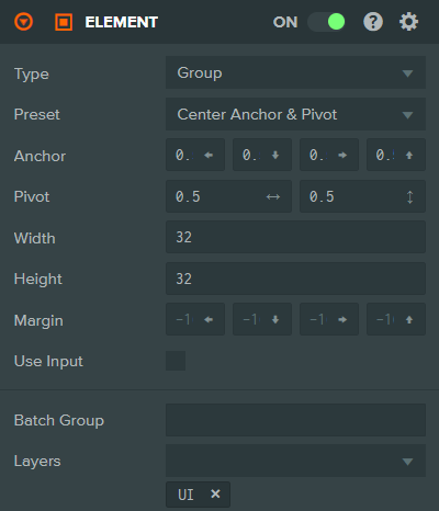
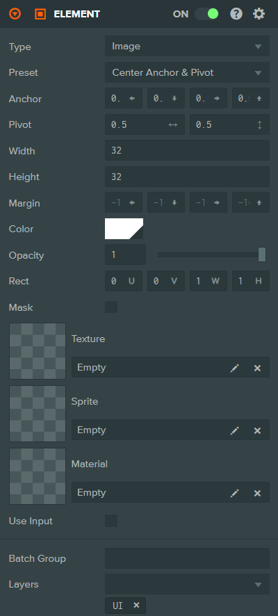
Image Element
The image element displays an image using a texture asset, sprite asset, or a solid color.
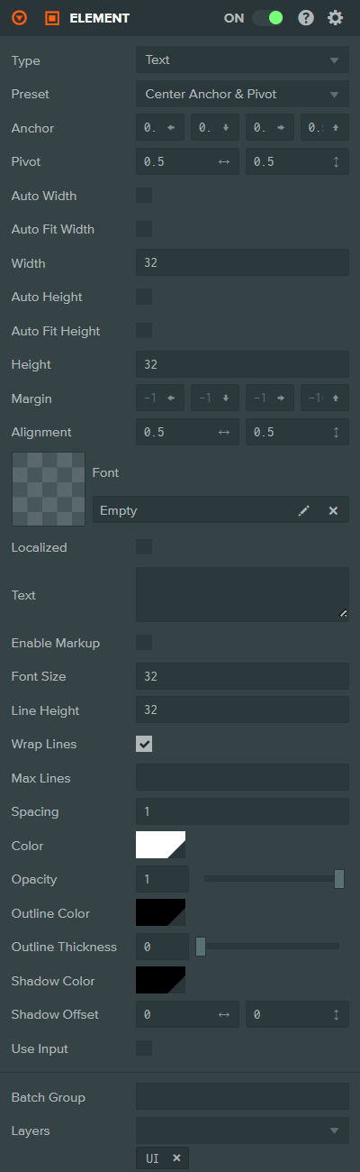
Text Element
The text element renders a string of text using a font asset.
Common Component Properties
| Property | Description |
|---|---|
| Type | The type of Element: Group, Image, or Text. |
| Preset | Choosing a layout preset will automatically set the Anchor and Pivot properties to a preset value. |
| Anchor | Determines where the element calculates its position in relation to. See the Elements#Anchor section for more information. |
| Pivot | Determines where the pivot point of the Element is. (0, 0) is bottom left, (1, 1) is top right. See the Elements#Pivot section for more information. |
| Auto Width | Text only. If enabled, the element's width will be automatically calculated based on the text content. |
| Auto Fit Width | Text only. If enabled, the font size will be automatically reduced to fit the text within the element's width. |
| Width | The width of the Element in pixels. May be disabled when Auto Width is enabled or when the anchor is horizontally split. |
| Auto Height | Text only. If enabled, the element's height will be automatically calculated based on the text content. |
| Auto Fit Height | Text only. If enabled, the font size will be automatically reduced to fit the text within the element's height. |
| Height | The height of the Element in pixels. May be disabled when Auto Height is enabled or when the anchor is vertically split. |
| Margin | The distance from the edge of the element to the Anchor. This is only available when the Anchor is split (non-equal in one axis). Specified as left, bottom, right, top. |
| Use Input | If enabled, this Element is added to the list of elements that check for input and fire input related events. |
| Batch Group | The Batch Group that this element belongs to. More on Batching here. |
| Layers | The Layers to render this element into. More on Layers here. |
Image Component Properties
| Property | Description |
|---|---|
| Color | The color to tint the element. |
| Opacity | The transparency of the element, from 0 (fully transparent) to 1 (fully opaque). |
| Rect | Defines the area of the texture asset to display, specified as U, V, Width, Height in normalized coordinates. Only shown when using a Texture. |
| Mask | Switch Image Element into a mask. Masks do not render into the scene, but instead limit child elements to only be rendered where this element is rendered. |
| Texture | The texture asset to display. Either a Texture, Sprite, or Material can be assigned, but not multiple. |
| Sprite | The sprite asset to display. Either a Texture, Sprite, or Material can be assigned, but not multiple. |
| Frame | The sprite frame index to display. Only shown when a Sprite is assigned. |
| Pixels Per Unit | The number of pixels that correspond to one unit in the component's coordinate system. Only shown when a Sprite is assigned. |
| Material | A custom material asset to use for rendering. Either a Texture, Sprite, or Material can be assigned, but not multiple. |
| Fit Mode | How the image should be fitted within the element bounds. Options are: Stretch (default), Contain (maintain aspect ratio, fit inside), Cover (maintain aspect ratio, fill). Only shown when a Texture or Sprite is assigned. |
Text Component Properties
| Property | Description |
|---|---|
| Alignment | Determines how the text is aligned within the element. (0, 0) is bottom left, (1, 1) is top right. |
| Font | The font asset to use for rendering text. |
| Localized | If enabled, the text will be looked up from the localization data using the Key property. |
| Text | The text string to display. Only shown when Localized is disabled. |
| Key | The localization key used to look up the translated text. Only shown when Localized is enabled. |
| Enable Markup | If enabled, the text can contain markup tags for styling (e.g., color, bold). |
| Font Size | The size in Screen Component pixels to render the font at. Only shown when Auto Fit Width and Auto Fit Height are disabled. |
| Min Font Size | The minimum font size when using Auto Fit Width or Auto Fit Height. |
| Max Font Size | The maximum font size when using Auto Fit Width or Auto Fit Height. |
| Line Height | The size in Screen Component pixels to move down for a new line. |
| Wrap Lines | If enabled, text that overflows the width of the text element will be wrapped to the next line. |
| Max Lines | The maximum number of lines to display. Text beyond this limit will be clipped. Only shown when Wrap Lines is enabled. |
| Spacing | A multiplier to apply to the amount of space between each character. |
| Color | The color to tint the font. |
| Opacity | The transparency of the element, from 0 (fully transparent) to 1 (fully opaque). |
| Outline Color | The color of the text outline, including alpha for opacity. |
| Outline Thickness | The thickness of the text outline, from 0 (no outline) to 1 (maximum thickness). |
| Shadow Color | The color of the text shadow, including alpha for opacity. |
| Shadow Offset | The offset of the text shadow from the text, specified as horizontal and vertical offset. |
See Also
- Screen Component - The root component for user interfaces
- Button Component - Interactive button elements
- LayoutGroup Component - Automatic layout of child elements
- LayoutChild Component - Override layout behavior for individual elements
- User Interface - Learn more about building user interfaces
Scripting Interface
You can control an Element Component's properties using a Script Component. The Element Component's scripting interface is here.