Button
The Button Component is a convenient shortcut for creating User Interface buttons for use with Screen and Element Components.
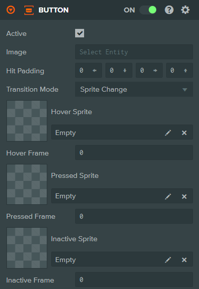
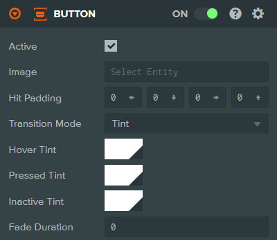
The Button Component can be used in two Transition Modes. Sprite Change, which uses a different sprite or frame for each button state or Tint, which tints a single sprite with a different color for each state.
Common Properties
| Property | Description |
|---|---|
| Active | When enabled the button will respond to and fire events. When disabled the button is set to the Inactive State. |
| Image | The Image Element Entity that is used to detect input events. |
| Hit Padding | Additional space around the Image Element that will be included when testing for input events. Specified as left, bottom, right, top padding values. |
| Transition Mode | The type of effect to use when transitioning between states. Either Sprite Change or Tint. |
Sprite Change Properties
| Property | Description |
|---|---|
| Hover Sprite | The Sprite Asset used when the button is in the Hover State. |
| Hover Frame | The Sprite Frame to display when the button is in the Hover State. |
| Pressed Sprite | The Sprite Asset used when the button is in the Pressed State. |
| Pressed Frame | The Sprite Frame to display when the button is in the Pressed State. |
| Inactive Sprite | The Sprite Asset used when the button is not active. |
| Inactive Frame | The Sprite Frame used when the button is not active. |
Tint Properties
| Property | Description |
|---|---|
| Hover Tint | The color to tint the Image Element with when the button is in the Hover State. |
| Pressed Tint | The color to tint the Image Element with when the button is in the Pressed State. |
| Inactive Tint | The color to tint the Image Element with when the button is in the Inactive State. |
| Fade Duration | The time in milliseconds to blend between the different state colors. |
See Also
- Element Component - Required for button visuals
- Screen Component - The root component for user interfaces
- User Interface - Learn more about building user interfaces
Scripting Interface
You can control a Button Component's properties using a Script Component. The Button Component's scripting interface is here.