User Interface - Text Input
Click here to see the project.
Overview
Text input can be done many ways in PlayCanvas and this tutorial shares a library that aims to be flexible enough to cover the most common cases.
It uses a HTML input element that is overlaid on top of the PlayCanvas rendering canvas and is positioned depending on whether mouse or touch is used to interact with the input element.
Using a HTML input element allows all the OS level operations that a user would expect on a webpage including copy and paste and password managers.
If touch is used, there is an assumption that a virtual keyboard would be shown and the HTML input element is positioned accordingly.
Here are examples of it being used on desktop:
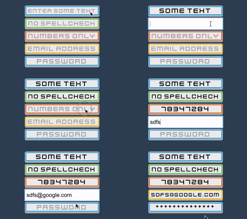
And on mobile:
This doesn't support 3D elements.
How to install
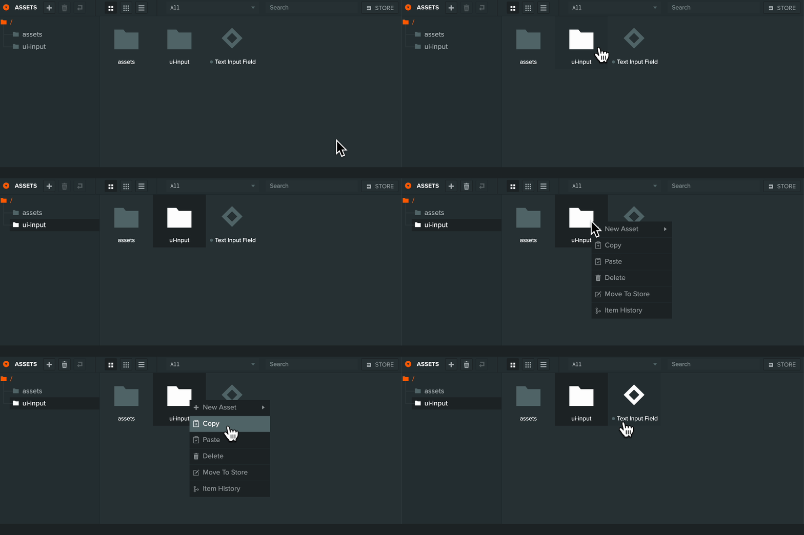
Open the example project, right click on the folder 'ui-input' and click on 'Copy'.
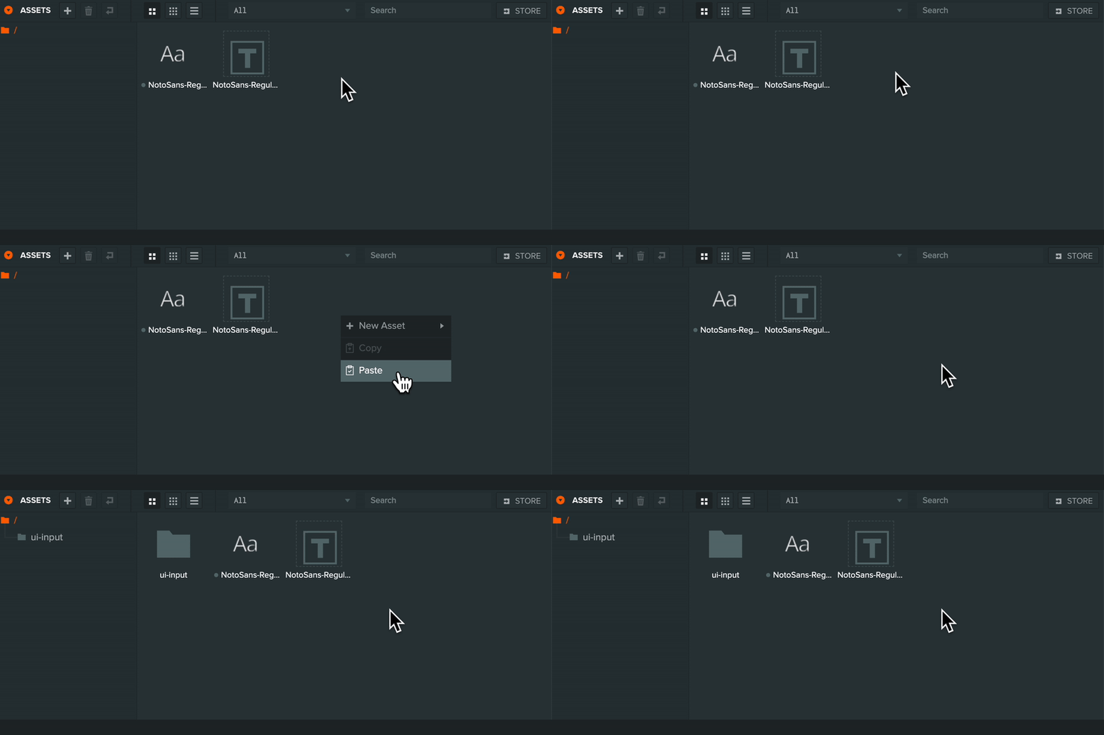
Open your project, right click in the assets panel and click on 'Paste'
Adding your first text input
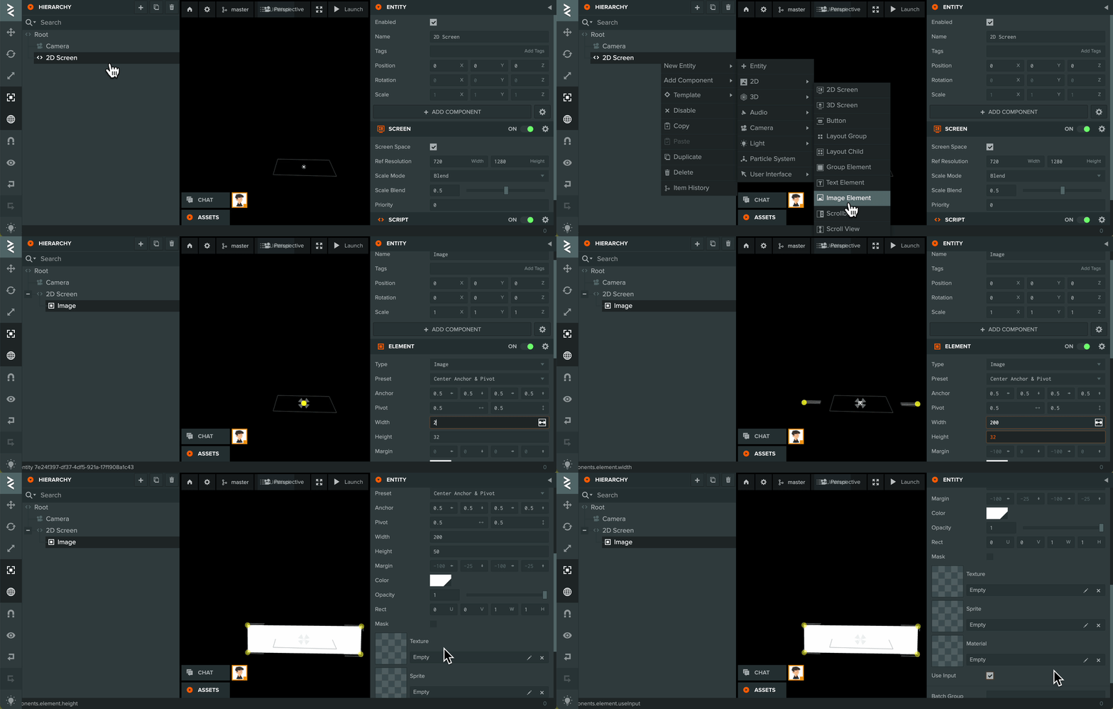
Create an UI Image/Group Element Entity as a child of a UI 2D Screen and size it accordingly. Make sure to enable 'Use Input' on the Element component. This defines the input area for the user to click on and start inputting text.
Add a Script Component to the Element Entity and add the Script Type 'uiInputField'.
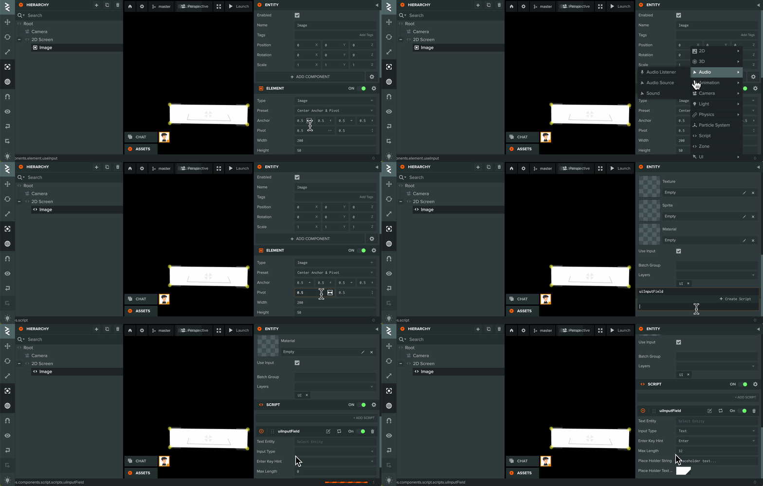
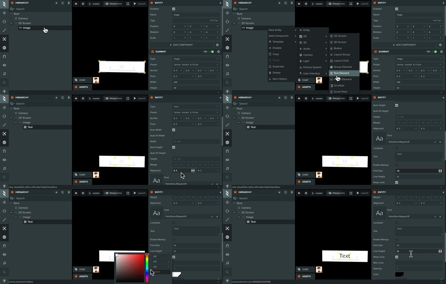
Create a UI Text Element Entity as a child of the Element Entity that we just created. The text in the element will updated by the Script Type 'uiInputField' based on the user input and the script attributes data.
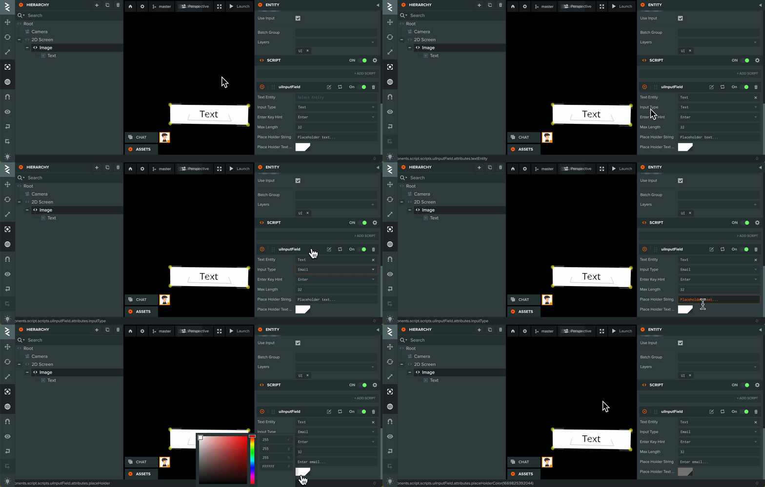
Go back to the Script Type 'uiInputField' that added earlier, reference the Text Element Entity and change the script attributes data to your use case. Hover over each attribute to see the tooltip and description.
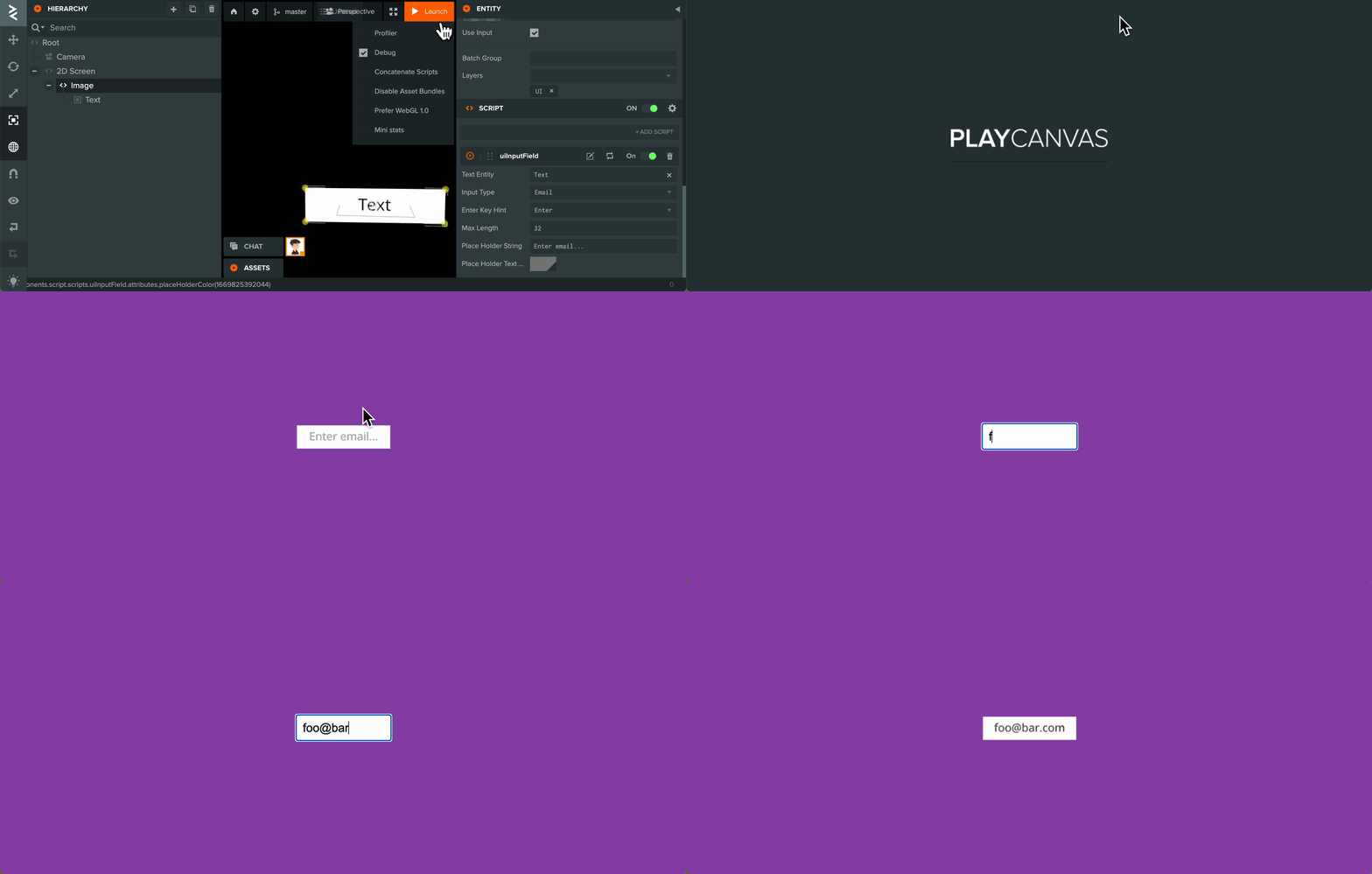
Finally, launch the scene to test.
Advanced: How to style
The library uses a neutral color style for the HTML input element. If you want to change the style to better suit your application, you can modify the CSS in 'ui-input-library.js' in function createInputDom.