Elements
Elements are the individual pieces that make up a user interface screen. A user interface element is added by attaching an Element component to an entity and adding that entity as a child or descendent of the Screen entity. An element that is part of a Screen differs from a regular entity in the way that its transform is calculated and hence the way that it is positioned on screen.
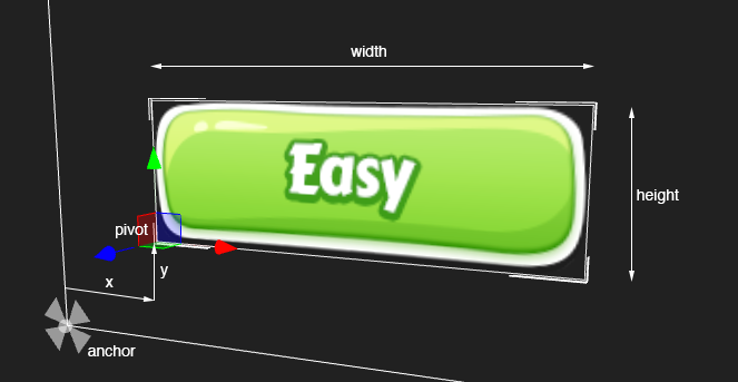
In addition to the local position, rotation and scale which are used to calculate an entity's position relative to its parent, Element components also use the anchor, pivot and margin properties to determine, where the local position should be measured against, where the center point of the Element rectangle should be and the distance between the edges of the Element rectangle and the anchors.
These new properties give you plenty of control to layout your user interfaces, including aligning them with other Elements or positioning them with fixed distances to Elements.
Element Positioning

Element Resizing
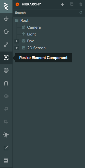
To resize your Element activate the Resize gizmo or press '4':

Then drag the corners around to adjust the size of the Element:

Pivot
The pivot property of an Element determines at which point the position, rotation and scale are calculated. The pivot is defined by two numbers between 0 and 1 which determine the pivot's position in the X and Y direction along the total width and height of the element. For example, [0,0] sets the pivot to the bottom left of the element, [1,1] sets the pivot to the top right of the element.
Anchor
The anchor property determines where the point or points on the parent that the Element's position is calculated from. The anchor value is specified by two points [minX, minY] and [maxX, maxY]. In the Editor this is displayed as 4 numbers: [minX, minY, maxX, maxY]
For example, setting the anchor to [0,0,0,0] will anchor the element to the bottom left of its parent. The position of the element will set the offset from the bottom left of the parent
Split Anchors
Sometimes it is useful to anchor different edges of an Element to different places. For example, if you wish to make an Element that stretches to fill the screen whatever the resolution. You can do this by splitting the anchor's min and max values.

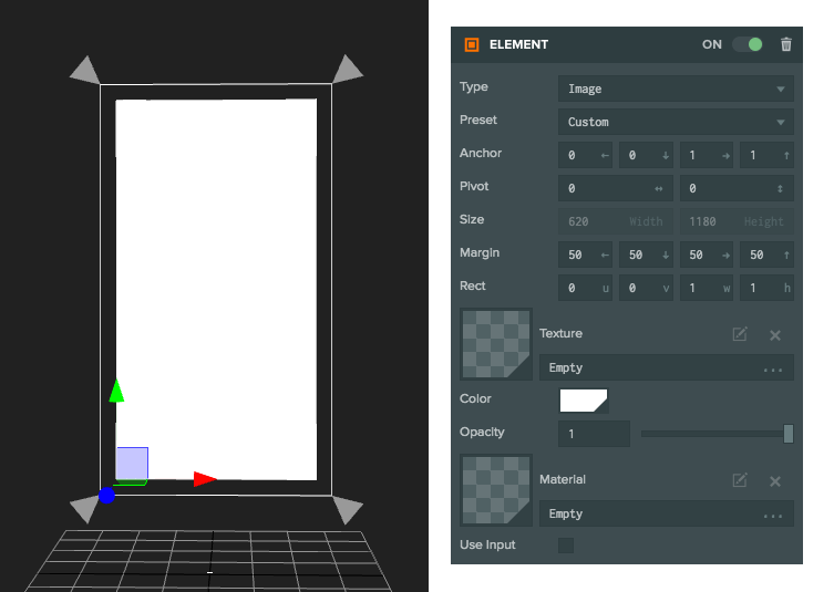
In this image the Anchor is set to [0,0,1,1] so we are anchoring the edges of the element to the edges of the parent. Each edge has a margin of 50 pixels so the Element is fixed to fill the parent with 50 pixels from edge.
Margin
The margin property is only available when the anchor value is split in one axis. The margin sets the number of Screen component pixels from the anchor that the edge of the element will be. Shortcuts to the margin values are available in scripts on the Element component as the properties left, right, top and bottom.
Loose Elements
Whilst the primary use-case of Elements is to be part of a User Interface Screen Component. It is valid to have an Element component which is not part of a screen. For example, a single in-world piece of text.
Sizes and positioning for Elements that do not have a Screen behaves slightly differently. Whereas for a screen a 32x32 Element is 32 pixels a Screen-less Element will be 32m by 32m. Adjust your sizes accordingly.