Getting Started
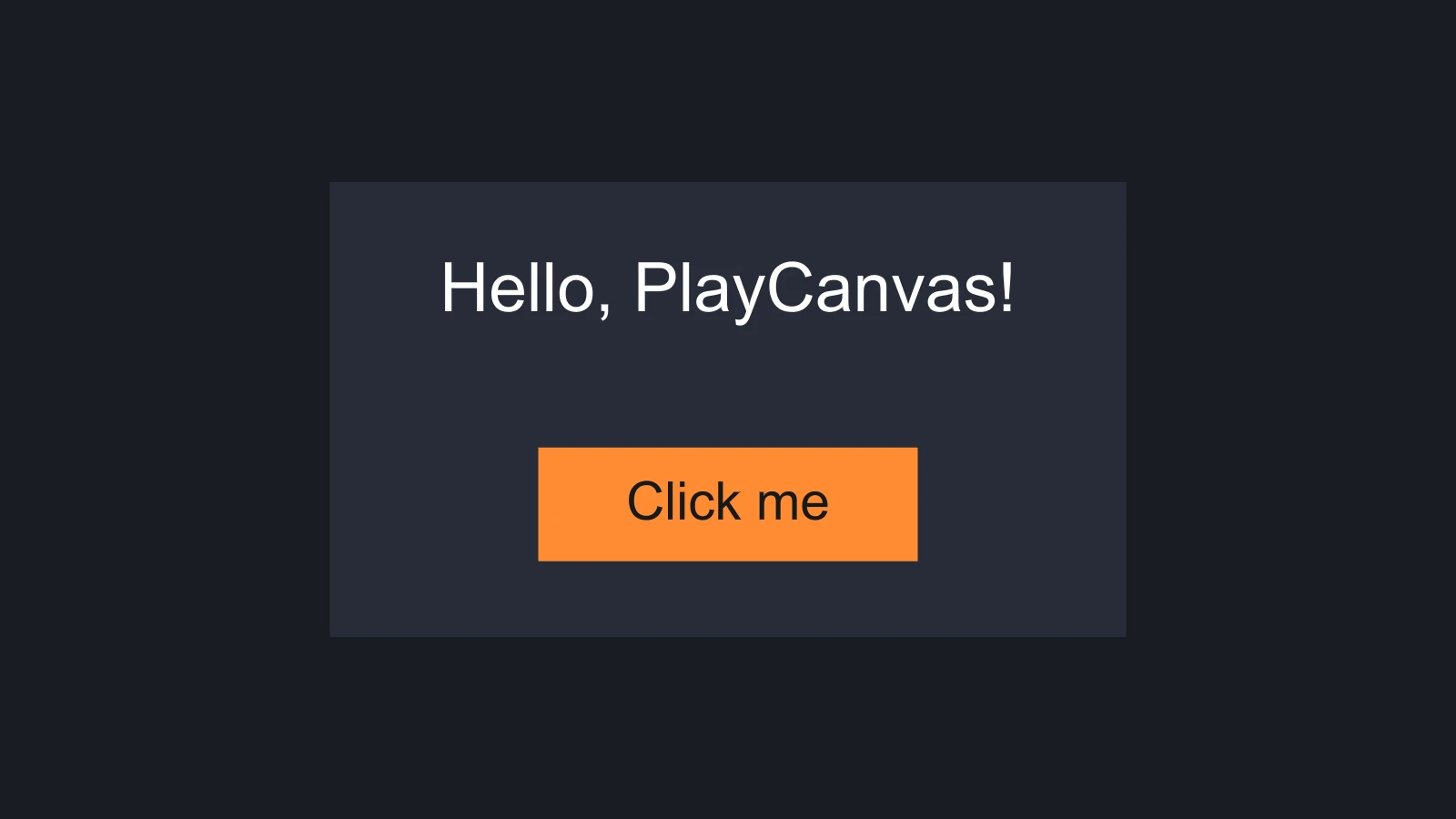
An in-canvas user interface is a tree of entities. At its root is an entity with a screen component, which defines the space the interface lives in. Below it, entities with element components are the rectangles you see: images, text and invisible groups that hold other elements. Components such as buttons and scroll views add behavior on top. This page sets up UI on each surface and builds a small interface: a panel with a label and a button that counts its clicks.
Setting Up
Screens and elements are drawn by any application that includes their component systems. To respond to input, an application also needs an ElementInput, the object that turns mouse, touch and XR events into events on elements.
- Engine
- Editor
- React
- Web Components
Register the UI component systems, the font and texture handlers, and an ElementInput when you create the application:
const canvas = document.getElementById('application');
const device = await pc.createGraphicsDevice(canvas, {
    deviceTypes: [pc.DEVICETYPE_WEBGPU]
});

const options = new pc.AppOptions();
options.graphicsDevice = device;

// Create the ElementInput before the mouse and touch devices, so that calling
// stopPropagation() in a UI event handler also hides the event from them
options.elementInput = new pc.ElementInput(canvas);
options.mouse = new pc.Mouse(canvas);
options.touch = new pc.TouchDevice(canvas);

options.componentSystems = [
    pc.CameraComponentSystem,
    pc.ScreenComponentSystem,
    pc.ElementComponentSystem,
    pc.ButtonComponentSystem
];
options.resourceHandlers = [
    pc.FontHandler,
    pc.TextureHandler
];

const app = new pc.AppBase(canvas);
app.init(options);
app.setCanvasFillMode(pc.FILLMODE_FILL_WINDOW);
app.setCanvasResolution(pc.RESOLUTION_AUTO);
app.start();

window.addEventListener('resize', () => app.resizeCanvas());
Add the systems of the other UI components as you use them: pc.ScrollViewComponentSystem, pc.ScrollbarComponentSystem, pc.LayoutGroupComponentSystem and pc.LayoutChildComponentSystem, plus pc.SpriteHandler and pc.TextureAtlasHandler for sprites. pc.Application registers every system and handler for you, but it does not create an ElementInput either, so pass one in its options. See Using the Engine Standalone for the rest of the setup.
There is nothing to set up. Launched and published applications create the ElementInput for you, using the mouse and touch settings in the INPUT section of the Settings panel.
UI does not respond to input in the Editor viewport. Launch the scene to try your buttons and scroll views.
There is nothing to set up. <Application> creates the ElementInput, together with the mouse and touch devices.
There is nothing to set up. <pc-app> creates the ElementInput, together with the mouse and keyboard devices.
Your First Interface
The interface in the image above is a screen with a panel on it. The panel holds a label and a button, and the button holds its own text. Text needs a font asset; the examples load one called arial.json, which you can generate from any font file.
- Engine
- Editor
- React
- Web Components
With the application set up as above:
// Load a font for the text
const font = new pc.Asset('arial', 'font', { url: 'fonts/arial.json' });
app.assets.add(font);
await new Promise((resolve) => {
    font.ready(resolve);
    app.assets.load(font);
});

const camera = new pc.Entity('camera');
camera.addComponent('camera', { clearColor: new pc.Color(0.1, 0.11, 0.13) });
app.root.addChild(camera);

// A screen-space screen that scales with the canvas
const screen = new pc.Entity('screen');
screen.addComponent('screen', {
    screenSpace: true,
    referenceResolution: [1280, 720],
    scaleMode: pc.SCALEMODE_BLEND,
    scaleBlend: 0.5
});
app.root.addChild(screen);

// A panel in the middle of the screen
const panel = new pc.Entity('panel');
panel.addComponent('element', {
    type: pc.ELEMENTTYPE_IMAGE,
    anchor: [0.5, 0.5, 0.5, 0.5],
    pivot: [0.5, 0.5],
    width: 420,
    height: 240,
    color: new pc.Color(0.16, 0.18, 0.23),
    opacity: 0.9
});
screen.addChild(panel);

// A label near the top of the panel
const label = new pc.Entity('label');
label.addComponent('element', {
    type: pc.ELEMENTTYPE_TEXT,
    fontAsset: font.id,
    text: 'Hello, PlayCanvas!',
    fontSize: 36,
    anchor: [0.5, 1, 0.5, 1],
    pivot: [0.5, 1]
});
label.setLocalPosition(0, -40, 0);
panel.addChild(label);

// A button near the bottom: an image element that receives input, and a
// button component that tints the image when it is hovered and pressed
const button = new pc.Entity('button');
button.addComponent('element', {
    type: pc.ELEMENTTYPE_IMAGE,
    anchor: [0.5, 0, 0.5, 0],
    pivot: [0.5, 0],
    width: 200,
    height: 60,
    color: new pc.Color(1, 0.55, 0.2),
    useInput: true
});
button.addComponent('button', {
    imageEntity: button,
    hoverTint: new pc.Color(1, 0.7, 0.45),
    pressedTint: new pc.Color(0.8, 0.4, 0.1)
});
button.setLocalPosition(0, 40, 0);
panel.addChild(button);

const buttonText = new pc.Entity('text');
buttonText.addComponent('element', {
    type: pc.ELEMENTTYPE_TEXT,
    fontAsset: font.id,
    text: 'Click me',
    fontSize: 28,
    color: new pc.Color(0.1, 0.1, 0.1),
    anchor: [0.5, 0.5, 0.5, 0.5],
    pivot: [0.5, 0.5]
});
button.addChild(buttonText);

// Count the clicks
let clicks = 0;
button.button.on('click', () => {
    clicks++;
    label.element.text = `Clicked ${clicks} times`;
});
-
Upload a
.ttfor.otffile to create a font asset. -
In the Hierarchy, click + and choose User Interface › 2D Screen. New entities are added below the selected entity, so keep the screen selected for the next step.
-
Add a User Interface › Image Element and rename it
Panel. In its Element component, set Preset to Center Anchor & Pivot, Width to 420, Height to 240, and pick a dark Color with an Opacity of 0.9. -
With the panel selected, add a User Interface › Text Element and rename it
Label. Set Preset to Top Anchor & Pivot, the entity's position to (0, -40, 0), Font to your font asset, Text toHello, PlayCanvas!and Font Size to 36. -
With the panel selected again, add a User Interface › Button. This creates a
Buttonentity, whose image element has Use Input enabled and whose button component already uses it as its Image, with aTextchild. Set the button's Preset to Bottom Anchor & Pivot, its position to (0, 40, 0), its size to 200 × 60 and its Color to orange, set Hover Tint and Pressed Tint to lighter and darker oranges, and set the child's Text toClick me. -
Add a Script component to the
Button, attach this script and drag theLabelentity onto its Label attribute:import { Entity, Script } from 'playcanvas';export class ClickCounter extends Script {static scriptName = 'clickCounter';/*** The text element that shows the count.** @attribute* @type {Entity}*/label;clicks = 0;initialize() {this.entity.button.on('click', () => {this.clicks++;this.label.element.text = `Clicked ${this.clicks} times`;});}} -
Launch the scene and click the button.
Render FirstInterface inside an <Application>. There is no <Button> component in @playcanvas/react yet, so the Button defined here adds the engine's button component to the entity it is placed in. It passes its props to the engine unchanged, so its colors are Color objects rather than the strings that <Element> takes:
import { useEffect, useRef, useState } from 'react';
import { Color } from 'playcanvas';
import { Entity } from '@playcanvas/react';
import { Camera, Element, Screen } from '@playcanvas/react/components';
import { useFont, useParent } from '@playcanvas/react/hooks';

function Button({ onClick, ...options }) {
  const entity = useParent();
  const handler = useRef(onClick);
  handler.current = onClick;

  useEffect(() => {
    entity.addComponent('button', { imageEntity: entity, ...options });
    const handle = entity.button.on('click', event => handler.current(event));
    return () => {
      handle.off();
      entity.removeComponent('button');
    };
  }, [entity]);

  return null;
}

export function FirstInterface() {
  const { asset: font } = useFont('fonts/arial.json');
  const [clicks, setClicks] = useState(0);
  if (!font) return null;

  return (
    <>
      <Entity name="camera">
        <Camera clearColor="#1a1c21" />
      </Entity>
      <Entity name="screen">
        <Screen referenceResolution={[1280, 720]} />
        <Entity name="panel">
          <Element type="image" anchor={[0.5, 0.5, 0.5, 0.5]} pivot={[0.5, 0.5]}
            width={420} height={240} color="#292e3b" opacity={0.9} />
          <Entity name="label" position={[0, -40, 0]}>
            <Element type="text" fontAsset={font} fontSize={36}
              text={clicks ? `Clicked ${clicks} times` : 'Hello, PlayCanvas!'}
              anchor={[0.5, 1, 0.5, 1]} pivot={[0.5, 1]} />
          </Entity>
          <Entity name="button" position={[0, 40, 0]}>
            <Element type="image" anchor={[0.5, 0, 0.5, 0]} pivot={[0.5, 0]}
              width={200} height={60} color="#ff8c33" useInput />
            <Button
              hoverTint={new Color(1, 0.7, 0.45)}
              pressedTint={new Color(0.8, 0.4, 0.1)}
              onClick={() => setClicks(c => c + 1)} />
            <Entity name="text">
              <Element type="text" fontAsset={font} text="Click me" fontSize={28}
                color="#1a1a1a" anchor={[0.5, 0.5, 0.5, 0.5]} pivot={[0.5, 0.5]} />
            </Entity>
          </Entity>
        </Entity>
      </Entity>
    </>
  );
}
<pc-app>
    <pc-asset id="arial" type="font" src="fonts/arial.json"></pc-asset>
    <pc-scene>
        <pc-entity name="camera">
            <pc-camera clear-color="#1a1c21"></pc-camera>
        </pc-entity>
        <pc-entity name="screen">
            <pc-screen screen-space scale-mode="blend" reference-resolution="1280 720"></pc-screen>
            <pc-entity name="panel">
                <pc-element type="image" anchor="0.5 0.5 0.5 0.5" pivot="0.5 0.5"
                            width="420" height="240" color="#292e3b" opacity="0.9"></pc-element>
                <pc-entity name="label" position="0 -40 0">
                    <pc-element type="text" font-asset="arial" font-size="36" text="Hello, PlayCanvas!"
                                anchor="0.5 1 0.5 1" pivot="0.5 1"></pc-element>
                </pc-entity>
                <pc-entity name="button" position="0 40 0">
                    <pc-element type="image" anchor="0.5 0 0.5 0" pivot="0.5 0"
                                width="200" height="60" color="#ff8c33" use-input></pc-element>
                    <pc-button hover-tint="1 0.7 0.45" pressed-tint="0.8 0.4 0.1"></pc-button>
                    <pc-entity name="text">
                        <pc-element type="text" font-asset="arial" text="Click me" font-size="28"
                                    color="#1a1a1a" anchor="0.5 0.5 0.5 0.5" pivot="0.5 0.5"></pc-element>
                    </pc-entity>
                </pc-entity>
            </pc-entity>
        </pc-entity>
    </pc-scene>
</pc-app>

<script type="module">
    import { whenReady } from '@playcanvas/web-components';

    // Count the clicks
    const button = await whenReady('pc-button');
    const label = document.querySelector('pc-entity[name="label"] > pc-element');
    let clicks = 0;
    button.component.on('click', () => {
        clicks++;
        label.setAttribute('text', `Clicked ${clicks} times`);
    });
</script>
How It Fits Together
The entity tree of the interface above is:
screen          screen component: the root, which defines the space of the interface
└── panel       image element
    ├── label   text element
    └── button  image element that receives input, and a button component
        └── text  text element
A few rules follow from it, and the rest of this section builds on them:
- Elements are laid out in screen units. On a screen-space screen that scales, like this one, a unit is a pixel at the 1280 × 720 reference resolution, and everything grows and shrinks with the canvas. See Screens.
- Children are positioned relative to their parent. Each element's anchor picks a point or an edge of its parent, and its pivot picks the point of the element that sits there. The label is anchored to the top of the panel, so moving or resizing the panel carries it along. The y axis points up. See Elements.
- The hierarchy is the draw order. A parent is drawn before its children, and earlier siblings before later ones, so the button's text is drawn over the button. See Draw Order and Performance.
- Only elements with input enabled receive input. The button's image element has
useInputon, and its events bubble up to its ancestors. See Input.
Naming Across Surfaces
Every surface drives the same components, so a property has one name in four spellings:
| Surface | Style | Example |
|---|---|---|
| Engine | camelCase properties. Vectors and colors are pc.Vec2, pc.Vec4 and pc.Color objects, or arrays when you pass them to addComponent | fontSize: 36, anchor: [0.5, 1, 0.5, 1] |
| Editor | Title Case inspector fields | Font Size, Anchor |
| React | camelCase props. Vectors are arrays and colors are CSS color strings | fontSize={36}, anchor={[0.5, 1, 0.5, 1]}, color="#ff8c33" |
| Web Components | kebab-case attributes. Vectors are space-separated numbers | font-size="36", anchor="0.5 1 0.5 1" |
A few properties have no React prop or Web Components attribute. For example, React reserves the key prop, and <pc-element> has no attribute for layers or rect. Set these on the engine component instead: in React, through the entity that useParent() or an <Entity ref> gives you, and in Web Components, through the element's component property once whenReady resolves.
Defaults Differ Between Surfaces
The component defaults are the engine's, but React changes some of them, so a screen or element created without options does not look the same everywhere:
| Engine | React | Web Components | |
|---|---|---|---|
| A screen with no options | World space, Scale Mode None, 640 × 320 | Screen space, Scale Mode Blend, reference resolution 1280 × 720 | World space, Scale Mode None, 640 × 320 |
| An element's anchor and pivot | Bottom-left: 0, 0, 0, 0 and 0, 0 | Bottom-left | Bottom-left |
| An element's size | 32 × 32 | 32 × 32 | 32 × 32 |
| Input devices | The ones you pass to AppOptions | Mouse, touch and element input | Mouse, keyboard and element input |
Set the properties you rely on explicitly, as the examples on this page do. The Editor's inspector shows every value of a new entity, so check it there.
See Also
- Screens - Screen space and world space, and scaling to fit any canvas
- Elements - Positioning and sizing with anchors, pivots and margins
- Input - Events, bubbling and keeping UI clicks away from the game
- User Interface - Buttons - Tutorial that builds buttons in the Editor
- Screen Component,
<pc-screen>and ScreenComponent - Reference for every screen property