Text Elements
The Text Element is used to display a string of text using a font asset.
Text
The Text Element contains a string field to enter the text that will be displayed. Use Shift+Enter to enter a new line character in the string field.
Text elements are rendered to the screen using a single quad for each character in the string. When you change the text property, we re-generate the mesh for the element. There is a performance implication for this, though there should be no problems changing text content for a reasonable number of Elements every frame.
Text Markup
Text elements support a simple markup syntax that allows you to apply different colors to specific parts of the text. Consider this example:
[color="#ff0000"]Red[/color], [color="#00ff00"]green[/color] and [color="#0000ff"]blue[/color].
Assuming the base color of the text element is white, this will render as follows:

You must proactively enable support for the markup syntax on a text element. You can do this via the API:
entity.element.enableMarkup = true;
Or by enabling it in the Editor:
Localization
You can check the 'Localized' checkbox to localize the text of the Text Element. If this is enabled then, instead of the text, you specify the localization key for the Text Element which will be used to get the localized text from the localization assets.
Read more about localization here.
Auto-size
By default a Text Element is set to automatically adjust its width and height to match the text string. You can disable this and specify the height and width of the element directly in the Editor panel.
The height of the character is determined by the largest character present in the font. It is the same for every character so as to avoid the string position changing depending on the contents of the string.
Alignment
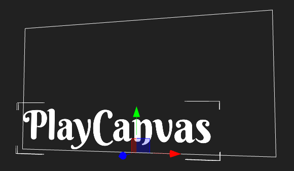
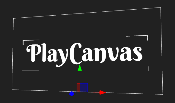
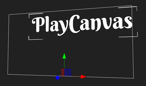
Text Elements have an additional tool to help with positioning which is the alignment. You will be used to how this property works from tools like Word Processes. In this case, rather than presets we expose a variable that can be altered. The alignment consists of two values [X, Y] each between 0 and 1. [0,0] is bottom left alignment, [0.5,0.5] is centered and [1,1] is top right.
Font Size & Line Height
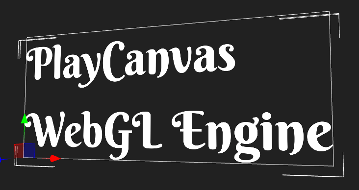
The font size property sets the rendered size of the font in Screen Component pixels. The line height sets the distance in Screen Component pixels to move down when the text contains a new line character.
Equal Font Size and Line Height is the default:
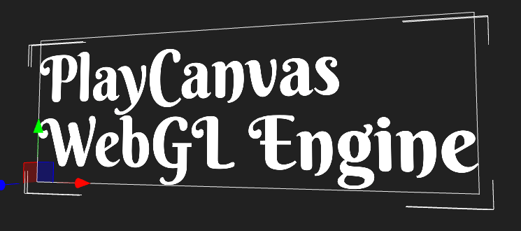
Increase Line Height to increase line spacing:
Spacing
The spacing property increases the distance between characters in a string. Fonts define the ideal distance to move the cursor forward for each character. The spacing property is a multiplier to this distance.
Tinting
The Color property allows you to tint the string to the color of your choice.
Transparency
The Opacity property allows you to set the transparency of the string
