Safe Areas
On many phones, parts of the display are covered: by a notch or a camera cutout, by rounded corners, or by the home indicator along the bottom edge. Browsers describe the rest of the display, the safe area, with four CSS environment variables: safe-area-inset-top, safe-area-inset-right, safe-area-inset-bottom and safe-area-inset-left, the distance in CSS pixels from each edge of the page that may be covered. An in-canvas interface knows nothing of them, so read them in code and keep the essential parts of the interface inside them.
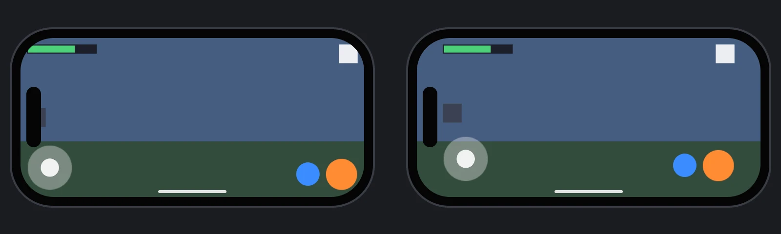
Letting the Page Reach the Edges
Unless a page asks otherwise, these browsers keep it clear of the covered areas themselves, for example by leaving bars at the sides of the display in landscape, and report insets of 0. To use the whole display, a page opts in with viewport-fit=cover in its viewport meta tag:
<meta name="viewport" content="width=device-width, initial-scale=1, viewport-fit=cover">
Applications published from the Editor include it. Add it to the pages you write yourself.
Reading the Insets
The environment variables are only available to CSS, so read them through an element padded with them:
// Read the safe-area insets, in CSS pixels, from an element padded with them
function readSafeAreaInsets() {
    const probe = document.createElement('div');
    probe.style.cssText = 'position: fixed; visibility: hidden; pointer-events: none; ' +
        'padding: env(safe-area-inset-top) env(safe-area-inset-right) env(safe-area-inset-bottom) env(safe-area-inset-left);';
    document.body.appendChild(probe);
    const style = getComputedStyle(probe);
    const insets = {
        top: parseFloat(style.paddingTop),
        right: parseFloat(style.paddingRight),
        bottom: parseFloat(style.paddingBottom),
        left: parseFloat(style.paddingLeft)
    };
    probe.remove();
    return insets;
}
The insets change when the phone is turned, so read them again whenever the canvas changes size.
Keeping the Interface Inside
Put the essential parts of the interface, such as scores, buttons and menus, below a group element that fills the screen, and give the group margins equal to the insets. Anchored to the group rather than to the screen, they stay inside the safe area, while backgrounds and decorations anchored to the screen still reach its edges.
The insets are in CSS pixels, and margins are in screen units. On a screen-space screen, one CSS pixel is canvas.width / canvas.clientWidth pixels of the drawing buffer, and one screen unit is scale pixels of the drawing buffer (see Screens). These examples assume a canvas that fills the page, as the insets are measured from the edges of the page:
- Engine
- Editor
- React
- Web Components
// A group that fills the screen, for everything that must stay in the safe area
const safeArea = new pc.Entity('safe area');
safeArea.addComponent('element', {
    type: pc.ELEMENTTYPE_GROUP,
    anchor: [0, 0, 1, 1],
    margin: [0, 0, 0, 0]
});
screen.addChild(safeArea);

// Anchored to the group, the pause button stays inside the safe area
const pauseButton = new pc.Entity('pause button');
pauseButton.addComponent('element', {
    type: pc.ELEMENTTYPE_IMAGE,
    anchor: [1, 1, 1, 1],
    pivot: [1, 1],
    width: 80,
    height: 80,
    useInput: true
});
safeArea.addChild(pauseButton);
pauseButton.setLocalPosition(-20, -20, 0);

const applySafeArea = () => {
    const insets = readSafeAreaInsets();
    const canvas = app.graphicsDevice.canvas;
    const units = (canvas.width / canvas.clientWidth) / screen.screen.scale;
    safeArea.element.margin = new pc.Vec4(
        insets.left * units,
        insets.bottom * units,
        insets.right * units,
        insets.top * units
    );
};
applySafeArea();
app.graphicsDevice.on('resizecanvas', () => applySafeArea());
Add a User Interface › Group Element below a 2D Screen and set its Preset to Stretch. Then add a Script component to it and attach this script, with readSafeAreaInsets from Reading the Insets pasted into the same file:
import { Script, Vec4 } from 'playcanvas';

export class SafeArea extends Script {
    static scriptName = 'safeArea';

    initialize() {
        this.apply();
        this.app.graphicsDevice.on('resizecanvas', this.apply, this);
        this.once('destroy', () => {
            this.app.graphicsDevice.off('resizecanvas', this.apply, this);
        });
    }

    apply() {
        const insets = readSafeAreaInsets();
        const canvas = this.app.graphicsDevice.canvas;
        const units = (canvas.width / canvas.clientWidth) / this.entity.element.screen.screen.scale;
        this.entity.element.margin = new Vec4(
            insets.left * units,
            insets.bottom * units,
            insets.right * units,
            insets.top * units
        );
    }
}
Move the elements that must stay in the safe area below the group.
SafeArea is a group that fills its screen, less the insets, and uses readSafeAreaInsets from Reading the Insets. Place it directly inside the screen's <Entity>, with the elements that must stay in the safe area inside it:
import { useEffect, useState } from 'react';
import { Entity } from '@playcanvas/react';
import { Element, Screen } from '@playcanvas/react/components';
import { useApp, useParent } from '@playcanvas/react/hooks';

export function SafeArea({ children }) {
  const app = useApp();
  const screen = useParent();
  const [margin, setMargin] = useState([0, 0, 0, 0]);

  useEffect(() => {
    const device = app.graphicsDevice;
    const apply = () => {
      const insets = readSafeAreaInsets();
      const units = (device.canvas.width / device.canvas.clientWidth) / screen.screen.scale;
      setMargin([insets.left * units, insets.bottom * units, insets.right * units, insets.top * units]);
    };
    apply();
    device.on('resizecanvas', apply);
    return () => device.off('resizecanvas', apply);
  }, [app, screen]);

  return (
    <Entity name="safe area">
      <Element type="group" anchor={[0, 0, 1, 1]} margin={margin} />
      {children}
    </Entity>
  );
}

export function Hud() {
  return (
    <Entity name="screen">
      <Screen referenceResolution={[1280, 720]} />
      <SafeArea>
        <Entity name="pause button" position={[-20, -20, 0]}>
          <Element type="image" anchor={[1, 1, 1, 1]} pivot={[1, 1]} width={80} height={80} useInput />
        </Entity>
      </SafeArea>
    </Entity>
  );
}
<pc-entity name="screen">
    <pc-screen screen-space scale-mode="blend" reference-resolution="1280 720"></pc-screen>
    <pc-entity name="safe area">
        <pc-element id="safe-area" type="group" anchor="0 0 1 1" margin="0 0 0 0"></pc-element>
        <pc-entity name="pause button" position="-20 -20 0">
            <pc-element type="image" anchor="1 1 1 1" pivot="1 1" width="80" height="80" use-input></pc-element>
        </pc-entity>
    </pc-entity>
</pc-entity>

<script type="module">
    import { whenReady } from '@playcanvas/web-components';

    const { app } = await whenReady('pc-app');
    const screen = await whenReady('pc-screen');
    const safeArea = await whenReady('#safe-area');

    const apply = () => {
        const insets = readSafeAreaInsets();
        const canvas = app.graphicsDevice.canvas;
        const units = (canvas.width / canvas.clientWidth) / screen.component.scale;
        const margin = [insets.left, insets.bottom, insets.right, insets.top].map(inset => inset * units);
        safeArea.setAttribute('margin', margin.join(' '));
    };
    apply();
    app.graphicsDevice.on('resizecanvas', apply);
</script>
Define readSafeAreaInsets from Reading the Insets in the same script.
An interface built with HTML and CSS can use the environment variables directly, for example with padding: env(safe-area-inset-top) env(safe-area-inset-right) env(safe-area-inset-bottom) env(safe-area-inset-left) on its root element.
Testing Without a Phone
Desktop browsers report insets of 0. To check a layout on the desktop, make readSafeAreaInsets return test values instead of the real ones, such as those of a phone in landscape with a camera cutout at the left:
// Test values in place of the real insets: remove before publishing
function readSafeAreaInsets() {
    return { top: 0, right: 47, bottom: 21, left: 47 };
}
To test with real insets without a phone, use a device simulator, such as the iOS Simulator that comes with Xcode.
See Also
- Screens - Scaling an interface and adapting it to any canvas
- HTML and CSS - Interfaces built with the DOM
- Mobile UI Safe Areas - Editor project with a reusable safe area script
env()- The CSS environment variables, on MDN