はじめに
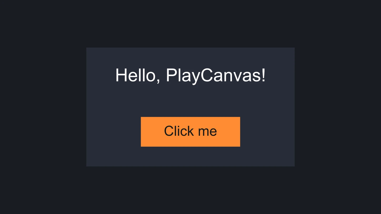
キャンバス内のユーザーインターフェースは、エンティティのツリーです。そのルートにはScreenコンポーネントを持つエンティティがあり、インターフェースが存在する空間を定義します。その下で、Elementコンポーネントを持つエンティティが、目に見える矩形になります。イメージ、テキスト、そして他のエレメントをまとめる不可視のグループです。ボタンやスクロールビューなどのコンポーネントが、その上に振る舞いを追加します。このページでは、各環境でUIをセットアップし、ラベルと、クリック回数を数えるボタンを載せたパネルという小さなインターフェースを構築します。
セットアップ
スクリーンとエレメントは、それらのコンポーネントシステムを含むアプリケーションであれば描画されます。入力に応答するには、アプリケーションにElementInputも必要です。これは、マウス、タッチ、XRのイベントをエレメント上のイベントに変換するオブジェクトです。
- Engine
- Editor
- React
- Web Components
アプリケーションを作成するときに、UIのコンポーネントシステム、フォントとテクスチャのハンドラー、ElementInputを登録します。
const canvas = document.getElementById('application');
const device = await pc.createGraphicsDevice(canvas, {
    deviceTypes: [pc.DEVICETYPE_WEBGPU]
});

const options = new pc.AppOptions();
options.graphicsDevice = device;

// ElementInputをマウスとタッチのデバイスより先に作成し、UIのイベントハンドラーで
// stopPropagation()を呼び出したときに、それらのデバイスからもイベントが隠されるようにする
options.elementInput = new pc.ElementInput(canvas);
options.mouse = new pc.Mouse(canvas);
options.touch = new pc.TouchDevice(canvas);

options.componentSystems = [
    pc.CameraComponentSystem,
    pc.ScreenComponentSystem,
    pc.ElementComponentSystem,
    pc.ButtonComponentSystem
];
options.resourceHandlers = [
    pc.FontHandler,
    pc.TextureHandler
];

const app = new pc.AppBase(canvas);
app.init(options);
app.setCanvasFillMode(pc.FILLMODE_FILL_WINDOW);
app.setCanvasResolution(pc.RESOLUTION_AUTO);
app.start();

window.addEventListener('resize', () => app.resizeCanvas());
他のUIコンポーネントを使う場合は、そのシステムも追加します。pc.ScrollViewComponentSystem、pc.ScrollbarComponentSystem、pc.LayoutGroupComponentSystem、pc.LayoutChildComponentSystem、さらにスプライトにはpc.SpriteHandlerとpc.TextureAtlasHandlerが必要です。pc.Applicationはすべてのシステムとハンドラーを自動的に登録しますが、こちらもElementInputは作成しないため、オプションで渡してください。その他のセットアップについてはエンジンをスタンドアロンで使用するを参照してください。
セットアップは不要です。エディターから起動したアプリケーションと公開したアプリケーションでは、設定パネルのINPUTセクションにあるマウスとタッチの設定に従って、ElementInputが自動的に作成されます。
エディターのビューポートでは、UIは入力に応答しません。ボタンやスクロールビューを試すには、シーンを起動してください。
セットアップは不要です。<Application>が、マウスとタッチのデバイスと一緒にElementInputを作成します。
セットアップは不要です。<pc-app>が、マウスとキーボードのデバイスと一緒にElementInputを作成します。
最初のインターフェース
上の画像のインターフェースは、パネルを1つ載せたスクリーンです。パネルはラベルとボタンを保持し、ボタンは自身のテキストを保持します。テキストにはフォントアセットが必要です。例ではarial.jsonというフォントアセットを読み込みます。これは任意のフォントファイルから生成できます。
- Engine
- Editor
- React
- Web Components
アプリケーションを上記のようにセットアップしたうえで、次のように記述します。
// テキスト用のフォントを読み込む
const font = new pc.Asset('arial', 'font', { url: 'fonts/arial.json' });
app.assets.add(font);
await new Promise((resolve) => {
    font.ready(resolve);
    app.assets.load(font);
});

const camera = new pc.Entity('camera');
camera.addComponent('camera', { clearColor: new pc.Color(0.1, 0.11, 0.13) });
app.root.addChild(camera);

// キャンバスに合わせてスケーリングする、スクリーン空間のスクリーン
const screen = new pc.Entity('screen');
screen.addComponent('screen', {
    screenSpace: true,
    referenceResolution: [1280, 720],
    scaleMode: pc.SCALEMODE_BLEND,
    scaleBlend: 0.5
});
app.root.addChild(screen);

// スクリーン中央のパネル
const panel = new pc.Entity('panel');
panel.addComponent('element', {
    type: pc.ELEMENTTYPE_IMAGE,
    anchor: [0.5, 0.5, 0.5, 0.5],
    pivot: [0.5, 0.5],
    width: 420,
    height: 240,
    color: new pc.Color(0.16, 0.18, 0.23),
    opacity: 0.9
});
screen.addChild(panel);

// パネルの上端付近のラベル
const label = new pc.Entity('label');
label.addComponent('element', {
    type: pc.ELEMENTTYPE_TEXT,
    fontAsset: font.id,
    text: 'Hello, PlayCanvas!',
    fontSize: 36,
    anchor: [0.5, 1, 0.5, 1],
    pivot: [0.5, 1]
});
label.setLocalPosition(0, -40, 0);
panel.addChild(label);

// 下端付近のボタン:入力を受け取るイメージエレメントと、ホバー時と押下時に
// イメージにティントをかけるButtonコンポーネント
const button = new pc.Entity('button');
button.addComponent('element', {
    type: pc.ELEMENTTYPE_IMAGE,
    anchor: [0.5, 0, 0.5, 0],
    pivot: [0.5, 0],
    width: 200,
    height: 60,
    color: new pc.Color(1, 0.55, 0.2),
    useInput: true
});
button.addComponent('button', {
    imageEntity: button,
    hoverTint: new pc.Color(1, 0.7, 0.45),
    pressedTint: new pc.Color(0.8, 0.4, 0.1)
});
button.setLocalPosition(0, 40, 0);
panel.addChild(button);

const buttonText = new pc.Entity('text');
buttonText.addComponent('element', {
    type: pc.ELEMENTTYPE_TEXT,
    fontAsset: font.id,
    text: 'Click me',
    fontSize: 28,
    color: new pc.Color(0.1, 0.1, 0.1),
    anchor: [0.5, 0.5, 0.5, 0.5],
    pivot: [0.5, 0.5]
});
button.addChild(buttonText);

// クリック回数を数える
let clicks = 0;
button.button.on('click', () => {
    clicks++;
    label.element.text = `Clicked ${clicks} times`;
});
-
.ttfまたは.otfファイルをアップロードして、フォントアセットを作成します。 -
ヒエラルキーで + をクリックし、User Interface › 2D Screenを選択します。新しいエンティティは選択中のエンティティの下に追加されるため、次の手順に備えてスクリーンを選択したままにしておきます。
-
User Interface › Image Elementを追加し、名前を
Panelに変更します。そのElementコンポーネントで、PresetをCenter Anchor & Pivot、Widthを420、Heightを240に設定し、暗いColorを選んでOpacityを0.9にします。 -
パネルを選択した状態でUser Interface › Text Elementを追加し、名前を
Labelに変更します。PresetをTop Anchor & Pivot、エンティティの位置を(0, -40, 0)、Fontを作成したフォントアセット、TextをHello, PlayCanvas!、Font Sizeを36に設定します。 -
もう一度パネルを選択した状態で、User Interface › Buttonを追加します。これにより
Buttonエンティティが作成されます。そのイメージエレメントではUse Inputが有効になっており、ButtonコンポーネントはすでにそのイメージエレメントをImageとして使用していて、子としてTextがあります。ボタンのPresetをBottom Anchor & Pivot、位置を(0, 40, 0)、サイズを200 × 60、Colorをオレンジ色に設定し、Hover TintとPressed Tintをそれぞれ明るいオレンジ色と暗いオレンジ色に設定して、子のTextをClick meにします。 -
ButtonにScriptコンポーネントを追加し、次のスクリプトをアタッチして、LabelエンティティをそのLabelアトリビュートにドラッグします。import { Entity, Script } from 'playcanvas';export class ClickCounter extends Script {static scriptName = 'clickCounter';/*** カウントを表示するテキストエレメント。** @attribute* @type {Entity}*/label;clicks = 0;initialize() {this.entity.button.on('click', () => {this.clicks++;this.label.element.text = `Clicked ${this.clicks} times`;});}} -
シーンを起動し、ボタンをクリックします。
FirstInterfaceを<Application>の中でレンダリングします。@playcanvas/reactにはまだ<Button>コンポーネントがないため、ここで定義するButtonは、配置されたエンティティにエンジンのButtonコンポーネントを追加します。propsは変更されずにそのままエンジンに渡されるため、色は<Element>が受け取る文字列ではなくColorオブジェクトで指定します。
import { useEffect, useRef, useState } from 'react';
import { Color } from 'playcanvas';
import { Entity } from '@playcanvas/react';
import { Camera, Element, Screen } from '@playcanvas/react/components';
import { useFont, useParent } from '@playcanvas/react/hooks';

function Button({ onClick, ...options }) {
  const entity = useParent();
  const handler = useRef(onClick);
  handler.current = onClick;

  useEffect(() => {
    entity.addComponent('button', { imageEntity: entity, ...options });
    const handle = entity.button.on('click', event => handler.current(event));
    return () => {
      handle.off();
      entity.removeComponent('button');
    };
  }, [entity]);

  return null;
}

export function FirstInterface() {
  const { asset: font } = useFont('fonts/arial.json');
  const [clicks, setClicks] = useState(0);
  if (!font) return null;

  return (
    <>
      <Entity name="camera">
        <Camera clearColor="#1a1c21" />
      </Entity>
      <Entity name="screen">
        <Screen referenceResolution={[1280, 720]} />
        <Entity name="panel">
          <Element type="image" anchor={[0.5, 0.5, 0.5, 0.5]} pivot={[0.5, 0.5]}
            width={420} height={240} color="#292e3b" opacity={0.9} />
          <Entity name="label" position={[0, -40, 0]}>
            <Element type="text" fontAsset={font} fontSize={36}
              text={clicks ? `Clicked ${clicks} times` : 'Hello, PlayCanvas!'}
              anchor={[0.5, 1, 0.5, 1]} pivot={[0.5, 1]} />
          </Entity>
          <Entity name="button" position={[0, 40, 0]}>
            <Element type="image" anchor={[0.5, 0, 0.5, 0]} pivot={[0.5, 0]}
              width={200} height={60} color="#ff8c33" useInput />
            <Button
              hoverTint={new Color(1, 0.7, 0.45)}
              pressedTint={new Color(0.8, 0.4, 0.1)}
              onClick={() => setClicks(c => c + 1)} />
            <Entity name="text">
              <Element type="text" fontAsset={font} text="Click me" fontSize={28}
                color="#1a1a1a" anchor={[0.5, 0.5, 0.5, 0.5]} pivot={[0.5, 0.5]} />
            </Entity>
          </Entity>
        </Entity>
      </Entity>
    </>
  );
}
<pc-app>
    <pc-asset id="arial" type="font" src="fonts/arial.json"></pc-asset>
    <pc-scene>
        <pc-entity name="camera">
            <pc-camera clear-color="#1a1c21"></pc-camera>
        </pc-entity>
        <pc-entity name="screen">
            <pc-screen screen-space scale-mode="blend" reference-resolution="1280 720"></pc-screen>
            <pc-entity name="panel">
                <pc-element type="image" anchor="0.5 0.5 0.5 0.5" pivot="0.5 0.5"
                            width="420" height="240" color="#292e3b" opacity="0.9"></pc-element>
                <pc-entity name="label" position="0 -40 0">
                    <pc-element type="text" font-asset="arial" font-size="36" text="Hello, PlayCanvas!"
                                anchor="0.5 1 0.5 1" pivot="0.5 1"></pc-element>
                </pc-entity>
                <pc-entity name="button" position="0 40 0">
                    <pc-element type="image" anchor="0.5 0 0.5 0" pivot="0.5 0"
                                width="200" height="60" color="#ff8c33" use-input></pc-element>
                    <pc-button hover-tint="1 0.7 0.45" pressed-tint="0.8 0.4 0.1"></pc-button>
                    <pc-entity name="text">
                        <pc-element type="text" font-asset="arial" text="Click me" font-size="28"
                                    color="#1a1a1a" anchor="0.5 0.5 0.5 0.5" pivot="0.5 0.5"></pc-element>
                    </pc-entity>
                </pc-entity>
            </pc-entity>
        </pc-entity>
    </pc-scene>
</pc-app>

<script type="module">
    import { whenReady } from '@playcanvas/web-components';

    // クリック回数を数える
    const button = await whenReady('pc-button');
    const label = document.querySelector('pc-entity[name="label"] > pc-element');
    let clicks = 0;
    button.component.on('click', () => {
        clicks++;
        label.setAttribute('text', `Clicked ${clicks} times`);
    });
</script>
全体の仕組み
上のインターフェースのエンティティツリーは次のとおりです。
screen          Screenコンポーネント:インターフェースの空間を定義するルート
└── panel       イメージエレメント
    ├── label   テキストエレメント
    └── button  入力を受け取るイメージエレメントと、Buttonコンポーネント
        └── text  テキストエレメント
このツリーからいくつかのルールが導かれ、このセクションの他のページはそれらを前提としています。
- エレメントはスクリーンの単位でレイアウトされます。 この例のようにスケーリングするスクリーン空間のスクリーンでは、1単位は1280 × 720の基準解像度における1ピクセルで、すべてがキャンバスに合わせて拡大・縮小します。スクリーンを参照してください。
- 子は親を基準に配置されます。 各エレメントのアンカーは親の点または辺を選び、ピボットはそこに合わせるエレメント側の点を選びます。ラベルはパネルの上端にアンカーされているため、パネルを移動したりサイズを変更したりすると、ラベルも一緒に動きます。y軸は上向きです。エレメントを参照してください。
- ヒエラルキーが描画順になります。 親は子より先に描画され、兄弟同士では前にあるものが後ろにあるものより先に描画されるため、ボタンのテキストはボタンの上に描画されます。描画順とパフォーマンスを参照してください。
- 入力が有効なエレメントだけが入力を受け取ります。 ボタンのイメージエレメントは
useInputがオンになっており、そのイベントは祖先へとバブリングします。入力を参照してください。
環境ごとの命名
どの環境も同じコンポーネントを操作するため、プロパティの名前は1つですが、その表記は4通りあります。
| 環境 | 表記 | 例 |
|---|---|---|
| Engine | キャメルケースのプロパティ。ベクトルと色はpc.Vec2、pc.Vec4、pc.Colorのオブジェクトで、addComponentに渡す場合は配列も使える | fontSize: 36, anchor: [0.5, 1, 0.5, 1] |
| Editor | 各単語の先頭が大文字(Title Case)のインスペクターのフィールド | Font Size, Anchor |
| React | キャメルケースのprops。ベクトルは配列、色はCSSの色文字列 | fontSize={36}, anchor={[0.5, 1, 0.5, 1]}, color="#ff8c33" |
| Web Components | ケバブケースの属性。ベクトルはスペース区切りの数値 | font-size="36", anchor="0.5 1 0.5 1" |
Reactのpropも、Web Componentsの属性もないプロパティがいくつかあります。例えば、Reactはkeyというpropを予約しており、<pc-element>にはlayersやrectの属性がありません。これらは代わりにエンジンのコンポーネントに設定します。ReactではuseParent()または<Entity ref>から得られるエンティティを通して、Web ComponentsではwhenReadyが解決した後に要素のcomponentプロパティを通して設定します。
環境によって異なるデフォルト値
コンポーネントのデフォルト値はエンジンのものですが、Reactはその一部を変更しています。そのため、オプションを指定せずに作成したスクリーンやエレメントは、どこでも同じ見た目になるわけではありません。
| Engine | React | Web Components | |
|---|---|---|---|
| オプションなしのスクリーン | ワールド空間、スケールモードはNone、640 × 320 | スクリーン空間、スケールモードはBlend、基準解像度1280 × 720 | ワールド空間、スケールモードはNone、640 × 320 |
| エレメントのアンカーとピボット | 左下:0, 0, 0, 0と0, 0 | 左下 | 左下 |
| エレメントのサイズ | 32 × 32 | 32 × 32 | 32 × 32 |
| 入力デバイス | AppOptionsに渡したもの | マウス、タッチ、エレメント入力 | マウス、キーボード、エレメント入力 |
このページの例のように、依存するプロパティは明示的に設定してください。エディターのインスペクターには新しいエンティティのすべての値が表示されるため、そこで確認してください。
関連情報
- スクリーン - スクリーン空間とワールド空間、あらゆるキャンバスに合わせたスケーリング
- エレメント - アンカー、ピボット、マージンによる配置とサイズ設定
- 入力 - イベント、バブリング、UIのクリックをゲームに届かせない方法
- ユーザーインターフェース - ボタン - エディターでボタンを構築するチュートリアル
- Screenコンポーネント、
<pc-screen>、ScreenComponent - スクリーンの全プロパティのリファレンス